
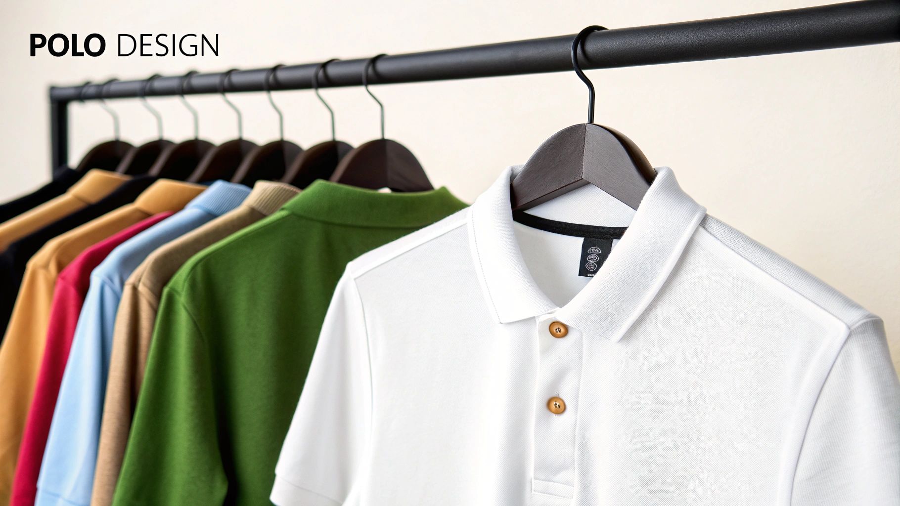
Polo Tee Shirt Design Your Team Will Actually Wear
Before you even think about firing up your design software, let’s get one thing straight: a killer polo tee shirt design starts with a plan, not pixels. A great design is more than just slapping a logo on a shirt; it’s a conversation starter, a piece of your brand's DNA, or a reflection of your personal style. It all begins by asking the right questions.
Laying the Groundwork for Your Polo Design
First things first: what’s this polo for? Is it for a corporate giveaway, a local footy club uniform, or a fresh drop for your streetwear line? The answer to that question changes everything that comes next, from the fabric you pick to the complexity of your artwork.
A corporate polo needs to look sharp and professional—think subtle, clean, and on-brand. But a design for a retail brand? That’s your chance to go big with bold, eye-catching graphics that turn heads.
No matter the purpose, the most crucial first step is to research your target audience effectively. Knowing who’s going to be wearing the shirt helps you nail the aesthetic, ensuring it’s something they’ll actually want to wear with pride.
Defining the Look and Feel
Think about the story you want this polo to tell. A minimalist embroidered logo on the left chest whispers quality and classic style. On the other hand, a massive, full-colour DTF print across the back screams modern, casual, and high-energy.
Let’s break it down by context:
- Corporate Use: The goal here is brand consistency. Stick to company colours and keep the design professional and understated.
- Sports Teams: You need visibility and team spirit. This is where you can use bolder colours, player numbers, and choose materials tough enough to handle some action.
- Fashion & Retail: This is your playground. Get creative with weird placements, artistic graphics, and designs that tap into current trends.
To make this crystal clear, here’s how your approach should shift based on the polo's job.
Key Design Considerations for Different Polo Shirt Uses
| Use Case | Recommended Material | Design Focus | Placement Tip |
|---|---|---|---|
| Corporate Uniform | 100% Cotton or Cotton Piqué | Professionalism, brand colours | Small, embroidered logo on the left chest or sleeve. |
| Promotional Giveaway | Polyester Blend | Visibility, bold logo/slogan | Large, vibrant DTF print on the back for maximum impact. |
| Sports Team Kit | Performance Polyester | Durability, team identity | Team crest on the chest, numbers/sponsors on the back/sleeves. |
| Retail Fashion Item | Premium Cotton or Unique Blends | Originality, artistic expression | Unconventional placements—try the collar, side seam, or a full back piece. |
This table is a solid starting point, but don't be afraid to mix and match to create something that truly stands out.
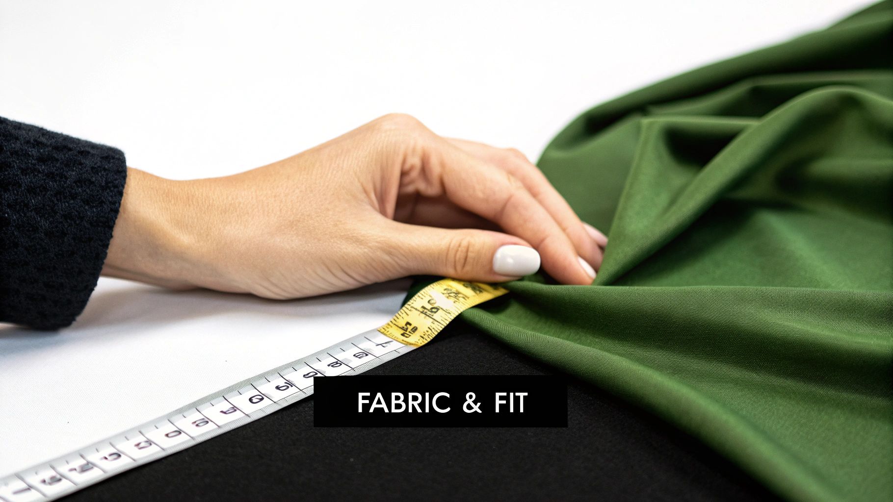
Material Matters More Than You Think
The fabric you choose isn’t just about how the shirt feels; it directly affects how your design looks. A classic cotton piqué, with its signature textured weave, has a timeless, premium feel but can sometimes disrupt the smoothness of a super-detailed print.
Modern performance blends, usually polyester-based, offer a much smoother surface. This makes them perfect for achieving crisp, vibrant DTF prints, and they come with bonus features like moisture-wicking. Your choice has to match the polo's purpose. A performance blend is a no-brainer for an athletic team, while 100% cotton often feels more upmarket for a high-end corporate gift.
Remember, the garment is the canvas. The texture, colour, and fit of the polo shirt itself are integral parts of the final design, not just a background for your logo.
Getting this groundwork right ensures your polo design isn’t just a pretty picture, but a thoughtful piece of apparel that’s perfectly suited for its intended audience and purpose.
Bringing Your Vision to Life with Design Software
Alright, let's get into the fun part: actually designing the thing. Getting your idea from your head onto a polo shirt that looks sharp and professional all comes down to the tools you use and how you set them up.
Choosing Your Design Tool
First things first, you need the right software. Your big decision here is whether to go with a vector-based program or a raster-based one.
For pretty much any apparel design, especially logos and text for a polo, vector is king. Software like Adobe Illustrator or Affinity Designer creates graphics using maths, not pixels. This means you can scale your design from a tiny sleeve detail to a massive print on the back without it ever losing quality. It stays perfectly crisp. That's why it's the industry standard.
On the other hand, you have raster software like Adobe Photoshop or Procreate. These are brilliant for photographic images or designs with really complex, painterly textures because they work with pixels. The catch? They have a fixed resolution. If you design something small and try to blow it up, it’ll turn into a blurry, pixelated mess. Stick with vector for clean, professional polo designs.
Setting Up Your Canvas for Success
Before you even think about dragging a shape or typing a word, you have to set up your digital file correctly. This is non-negotiable. Skipping this is like trying to build a house on a dodgy foundation – it’s just not going to end well. Getting these settings right from the get-go is what separates the pros from the amateurs.
When you hit 'Create New Document', you'll see a few critical options. Pay close attention here.
- Colour Mode: Always, and I mean always, set this to CMYK (Cyan, Magenta, Yellow, Key/Black). This is the colour language that printers speak. If you design in RGB (which is for screens), the colours will shift when printed, and you'll be left with a polo that looks nothing like what you saw on your monitor.
- Resolution: This needs to be 300 DPI (dots per inch). This is the gold standard for high-quality printing. Anything less will look fuzzy and unprofessional. You want your design to be sharp, not soft.
- Canvas Size: Simple one this – make the canvas the actual size you want the final print to be. A standard left-chest logo, for example, is usually around 4x4 inches, so that’s a great starting point for your canvas.
Here’s a look at the new document screen in Adobe Illustrator. This is mission control for your project.
Nailing these settings ensures every part of your design is primed for the physical printing process right from the start.
Getting your file setup right isn’t just a technical step; it's the first quality control check for your design. A perfectly prepared file translates directly to a vibrant, crisp, and professional-looking final product.
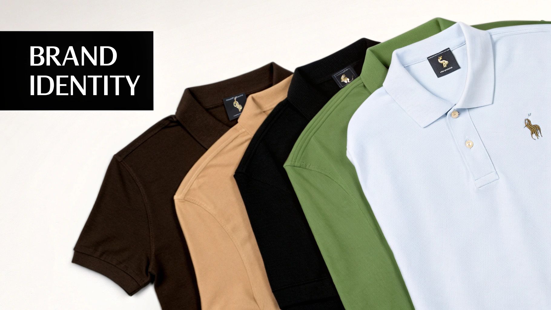
Integrating Your Branding and Ideas
With your file prepped and ready, it’s time to create.
If your design is mostly text, your font choice is everything. You need something clean and bold that won't get lost in the polo's fabric texture. Super thin or overly fancy fonts can look great on screen but often turn into a smudge on the final garment.
Think about the polo's base colour, too. You want contrast. A white design on a navy polo? Classic, strong, and impossible to miss. A light grey design on a white polo? It's going to look washed out and weak.
If you need a bit of a creative jump-start, an AI T-Shirt Design Generator can be a surprisingly useful tool for brainstorming concepts or exploring different visual styles quickly.
Ultimately, the best polo designs feel intentional. They blend strong typography, smart colour choices, and clear branding into a single, wearable statement.
Prepping Your Design for Flawless DTF Printing
Direct-to-Film (DTF) is an absolute beast for creating detailed, full-colour graphics on a custom polo tee shirt design. But here's the hard truth: the final print is only ever as good as the file you send over. Nailing your file prep is the critical last step that turns a design on your screen into a killer physical garment.
If you want razor-sharp results, especially for logos and text, a vector file (think AI, EPS, or SVG) is the only way to go. It’s the industry standard for a reason. Unlike pixel-based images that get blurry when you resize them, vectors are built with maths. That means you can scale them from a tiny chest logo to a massive back piece without losing a single drop of quality. Everything stays crisp.
The image below gives you a solid idea of the creative process before you even get to the technical stuff.
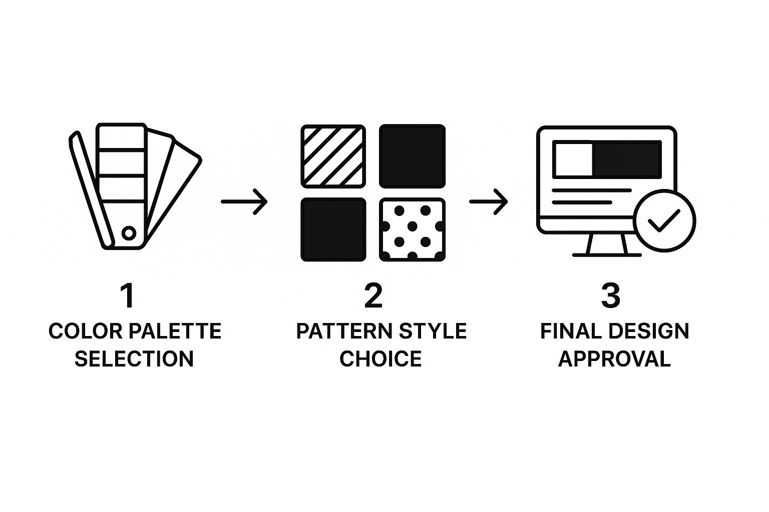
As you can see, thinking about colour and pattern early on is key. It ensures the whole design works together from the start, long before you save that final file.
Mastering the Technical Details
Once your creative vision is locked in, it's time for a few technical checks. First up, convert all your text to outlines or paths. This basically turns the letters into solid shapes. Why bother? It means the printer doesn’t need your specific font installed, preventing any weird font swaps that can ruin the look.
Next, get ruthless with your colours and transparency. DTF printing just doesn't play well with semi-transparent elements or those soft, feathered glows. They tend to come out looking muddy and inconsistent. Stick to solid colours for the best results. If you're weighing up your options, it's worth checking out our breakdown of DTF vs screen printing for graphic tees to see how each method handles colour.
Creating the White Underbase
This is probably the single most important step for DTF, especially if you're printing on anything other than a white polo. The white underbase is a separate layer of white ink that goes down first, right onto the fabric. Your actual colour design is then printed on top of this white foundation.
Without a solid white underbase, your colours will look dull and washed out on a coloured polo. It’s like trying to paint on a dark wall without a primer—the colours just sink in and lose all their punch. The underbase makes them pop, keeping them bright and true to your original design.
Your printer usually handles the technical side of creating the underbase, but you need to give them a file that makes it possible. This is another reason vectors are king—isolating colours is a breeze. If you have to use a pixel-based file, a high-res PNG with a transparent background is your next best bet, as the printer can generate the underbase from the solid parts of your image.
To make sure your file is ready for production, steer clear of these common mistakes:
- Ultra-fine details: Tiny text or lines thinner than 1pt often don't transfer properly, leaving you with a broken, incomplete print.
- Out-of-gamut colours: Those super-bright, neon colours that look electric on your RGB screen often can't be reproduced with CMYK printing inks. They'll come out looking flatter than you expect.
- Low-resolution images: If you're using a raster image (like a JPEG or PNG), it absolutely must be at least 300 DPI at the size you want it printed. Anything less will look pixelated and amateur.
Take a few extra minutes to prep your files properly. It’s the difference between a polo tee shirt design that looks sharp, professional, and vibrant, and one that just falls flat.
Picking the Right Polo and Working with Your Printer
Look, even the sickest digital design will look rubbish on the wrong garment. The physical polo shirt is the final piece of the puzzle, and your choice of fabric and weave will make or break the final DTF print.
The polo shirt started life as sportswear, born out of a need for something comfy but still smart. The classic piqué knit, popularised in the late 19th century, was all about offering a breathable alternative to stuffy, restrictive clothing. That history tells you everything you need to know about the demand for functional, stylish fabrics.
That classic piqué weave, with its textured, almost honeycomb-like feel, looks premium but can sometimes mess with the smoothness of a super-detailed DTF print. For razor-sharp results, a jersey knit offers a much flatter, more consistent canvas, letting the ink sit exactly where it should.
Choosing the Best Fabric Blend
The material of your polo is just as crucial as the weave. Every fabric blend reacts differently to DTF transfers, affecting everything from the punchiness of the colours to how the shirt holds up after a dozen washes.
Here’s a quick rundown of the usual suspects:
- 100% Cotton: This is the gold standard for DTF. It gives the ink a perfect surface to stick to, making colours pop like nothing else. It’s breathable, feels great, and is ideal for high-end corporate gear or retail drops.
- Polyester/Cotton Blends: A 50/50 or 60/40 blend is the versatile workhorse. You get the softness and print quality of cotton mixed with the durability, wrinkle resistance, and sweat-wicking magic of polyester. Perfect for team uniforms or promotional polos that need to last.
- 100% Polyester: Think performance polos. While DTF works a treat on polyester, you might notice the colours aren't quite as intense as on pure cotton. But for sportswear where staying dry is non-negotiable, it’s the only real choice.
Your Guide to Printer Collaboration
Nailing the garment is only half the battle. Clear, direct communication with your printing partner is what stops your vision from turning into a nightmare. Don't just assume they can read your mind.
The most expensive printing mistakes almost always come from simple miscommunications. A detailed brief and a pre-production sample aren't just 'nice to have'—they're your insurance policy against a botched order.
Before you give the green light for a full run, arm your printer with a clear checklist. For some solid advice on finding a reliable partner, check out our guide on working with custom T-shirt printers. Confirm the exact file format they need, be ridiculously specific about print placement (e.g., "logo is 8cm down from the left shoulder seam"), and lock in the final print dimensions.
And the most important part? Always, always get a printed sample. A digital mock-up is fine, but it’s not real. Nothing beats holding the actual shirt. This one step lets you check the colours, feel the print quality on your chosen fabric, and confirm the placement before you commit to a full order. It will save you a world of time, money, and stress.
Getting to Grips with the UK Market and What’s Trending
To nail a polo tee design that actually sells, you’ve got to get inside the head of your audience. What’s going on culturally that shapes what they want to wear? In the UK, the polo shirt isn't just a timeless classic; it's a chameleon, constantly shifting between smart casual, sportswear, and even high-end fashion. If you don't tap into that, you're just designing in the dark.
And the market for them is massive. We're not talking small numbers here. The UK is a big slice of a European polo market that helps make up a global industry worth $5,792.1 million. It's not slowing down, either. Projections show a steady climb with a Compound Annual Growth Rate (CAGR) of around 2.5% through 2033. You can get more nerdy with the stats and check out the European polo market trends on archivemarketresearch.com.
This growth is all down to the polo’s double life – it’s perfect for everyday wear but has also become a massive player in the unstoppable athleisure movement.
The Athleisure Takeover
Let's be real, the biggest thing to happen to the polo in years is the rise of athleisure. This isn’t just about people wearing tracksuits to the pub. It's about performance-driven style bleeding into every part of life. People now expect their polos to do more – they need to be comfy on the commute, sharp enough for a client meeting, and technical enough for a weekend kickabout.
This trend completely changes how you should approach your design:
- Think Beyond Cotton: The game has moved on from standard cotton piqué. Think performance blends, fabrics that wick sweat, and materials with a bit of stretch.
- Keep it Clean: The look is minimalist. Clean lines, subtle branding, and muted, sophisticated colours are what's working. This is what lets a polo jump from the gym to the office without looking out of place.
- It’s in the Details: Swap out button plackets for sleek zip-necks. Look at bonded seams instead of traditional stitching. Add tiny reflective details. These little nods to sportswear tech make a design feel modern and premium.
Don't Design for Everyone
A one-size-fits-all polo is a one-size-fits-none polo. The best brands know their audience and design specifically for them. Men, women, and kids all want different things from a polo shirt.
A men's design might stick to a classic, athletic fit with a bold, simple logo on the chest. For women, you see a lot more variety in the cut – from tightly tailored fits to more relaxed, boxy silhouettes, often with a wider range of colours and more creative logo placements. And for kids? Go wild. This is where you can bring in the bright, playful colours and bolder graphics.
A killer polo design isn't just pulled out of thin air. It’s a direct response to how people are living their lives, what they care about, and the visual culture they're part of. Match your design to these drivers, and you're not just making something that looks good—you're making something that’s smart business.
The lines are blurring everywhere, too. Just look at how alternative streetwear is influencing luxury fashion to see how high-end and casual styles are crashing into each other. That's the exact energy that's redefining what a modern polo can be.
Your Polo Tee Shirt Design Questions Answered
When you're diving into custom polo shirts, a few questions always pop up. Getting them sorted early on is the key to avoiding a box of expensive misprints and making sure the final product looks as sharp in real life as it did on your screen.
So, let's cut through the noise and get straight to it.
What’s the Best File Format for a DTF Polo Design?
If you want your print to be razor-sharp, a vector file is your best friend. Always.
Formats like AI (Adobe Illustrator), EPS, or SVG are the gold standard because they’re built from mathematical lines, not pixels. That means you can scale your logo from the size of a pinhead to a billboard without it ever getting blurry or pixelated.
Vector files also make life way easier for the printer, especially for separating colours. This is crucial for creating that solid white underbase needed to make your design pop on a coloured polo. If you’re working with a photograph, the next best thing is a high-resolution PNG file (300 DPI) with a transparent background. No exceptions.
Where’s the Best Place to Put a Logo on a Polo?
The left chest. It's the classic, go-to spot for a reason—it’s clean, professional, and always visible. It just works.
If you’ve got a bigger, bolder graphic that needs more room to breathe, the full back is a fantastic canvas. Just remember to be mindful of the button placket on the front. Nothing screams "amateur hour" like a logo awkwardly sliced in half by the buttons.
Quick tip from experience: A great starting point for a left chest logo is about 7-9 inches down from the highest point of the shoulder seam and 3-4 inches across from the centre line. But always, always mock it up digitally first to see how it sits.
Can I Actually Print a Photo on a Polo with DTF?
You absolutely can. DTF printing is a beast when it comes to reproducing full-colour photos and ridiculously complex graphics with incredible detail.
But there's a catch: your image file has to be top-notch. We’re talking a minimum of 300 DPI (dots per inch) at the final size you want it printed. Save it as a PNG with a transparent background. This is non-negotiable, as it stops the printer from slapping a big white or coloured box around your image. You want the design to look like it belongs on the fabric, not like a sticker.
Which Polo Material Makes DTF Prints Look the Best?
DTF is incredibly versatile and plays nice with cotton, polyester, and all sorts of blends.
However, if you're chasing the most vibrant, punch-in-the-face colours, 100% cotton (or a high-cotton blend) is king. It gives the ink a perfect surface to grab onto.
That being said, modern performance polos made from polyester also produce amazing, durable results. So honestly, DTF is a rock-solid choice for pretty much any polo you throw at it.
Ready to bring your own unique polo tee shirt design to life with vibrant, durable DTF printing? At Psyque, we specialise in creating high-quality custom apparel that stands out. Start creating your perfect polo today at https://psyque.co.uk.