
cmyk vs rgb for print: Master Color for UK Designers
The real difference between CMYK vs RGB for print is pretty simple when you boil it down: RGB is for screens, and CMYK is for ink. RGB creates colours using light, which is why your designs look so bright and alive on a monitor. CMYK, on the other hand, uses ink to remove (or subtract) light from a white surface, which is why colours can sometimes look a bit different once they're actually printed.
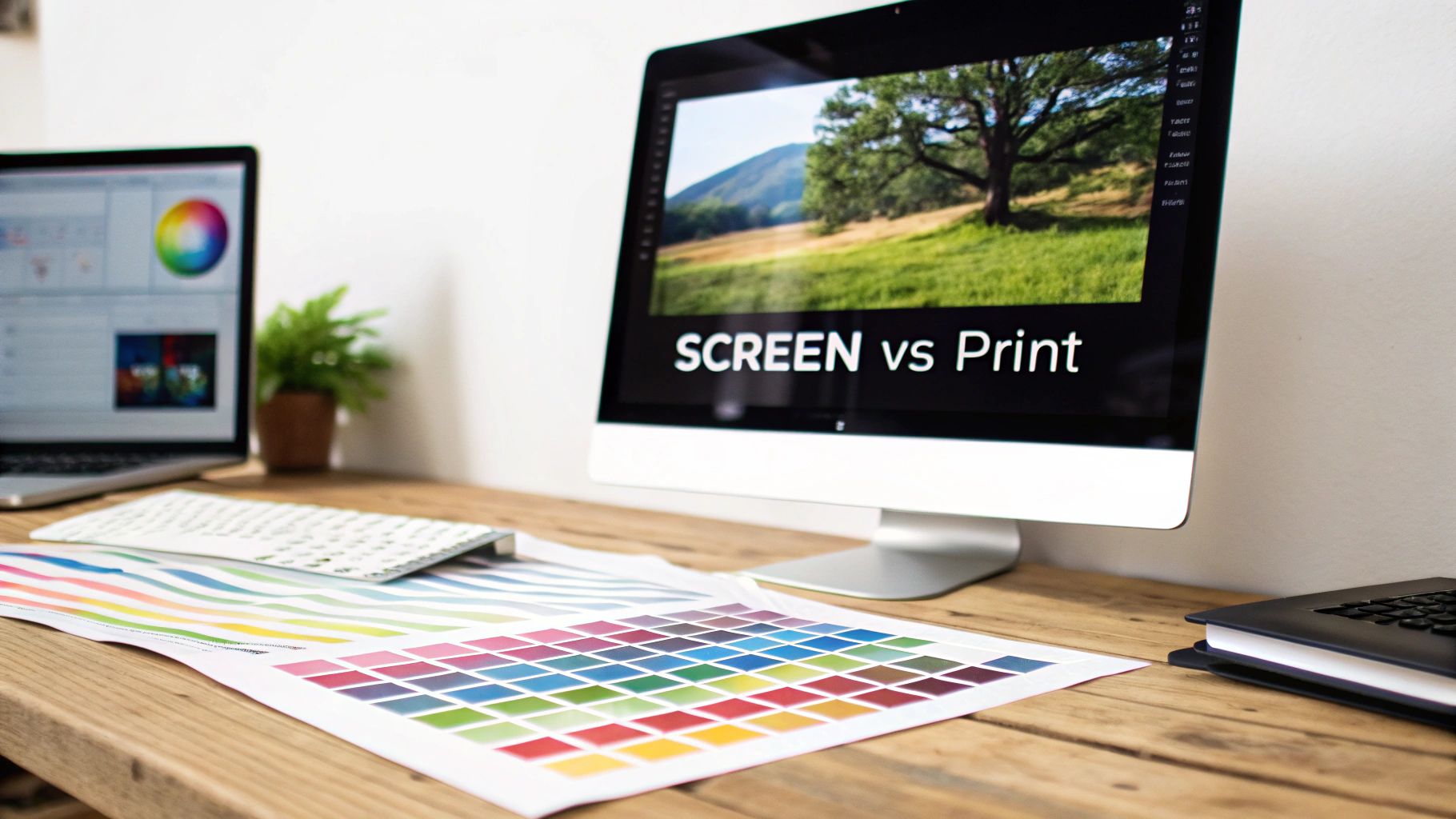
The Core Conflict Between Screen and Print Colour
Every designer has felt that pang of disappointment. You perfect a design on-screen, the colours are popping, it looks incredible... and then the printed version comes back looking dull and flat. This isn't a mistake by the printer; it's a fundamental clash between two completely different ways of creating colour.
Your screen is built on the RGB (Red, Green, Blue) colour model. It's an additive process. Think of it like this: your monitor starts as a black canvas and adds red, green, and blue light in different combinations to build a huge spectrum of colours. When all three are blasted at full power, you get pure white light. Seeing how things like vibrant digital LED signs work is a great way to understand this light-based model in action.
Printing, however, relies on the CMYK (Cyan, Magenta, Yellow, Key/Black) model. This is a subtractive process. It starts with a white surface—like paper or our DTF transfer film—and subtracts brightness by adding layers of ink. As each ink is laid down, it absorbs light, making the final colour appear darker to your eye.
Additive vs Subtractive Colour
The heart of the problem is something called the colour gamut—the total range of colours that a particular model can reproduce. The RGB gamut is massive compared to CMYK's. It can create dazzlingly bright, almost fluorescent colours that physical CMYK inks simply can't replicate. That's the reason why your electric blue on-screen can turn into a much calmer navy blue in print.
This isn't about one model being "better" than the other. It's about using the right tool for the right job. RGB is the language of light, perfect for digital media. CMYK is the language of ink, essential for physical products.
Getting this distinction right is absolutely vital for decorating garments. If you're digging into the nuances of getting great colour on apparel, our guide to printing on T-shirts in the UK has plenty more practical tips.
RGB vs CMYK A Quick Comparison
Understanding the fundamental differences between the digital and print colour models is the first step toward mastering your print outcomes. Here's a quick breakdown.
| Attribute | RGB (For Screens) | CMYK (For Print) |
|---|---|---|
| Stands For | Red, Green, Blue | Cyan, Magenta, Yellow, Key (Black) |
| Colour Model | Additive (adds light to a black screen) | Subtractive (subtracts light from a white surface) |
| Best Used For | Websites, social media, digital ads, apps | Business cards, brochures, DTF transfers, flyers |
| Colour Gamut | Larger, capable of producing bright neons | Smaller, more limited to what ink can replicate |
| Mixing Result | Mixing R, G, and B at full intensity creates white | Mixing C, M, and Y at full intensity creates a dark brown |
This table neatly sums up why what you see on your screen isn't always what you get on paper (or a T-shirt!). It's all about starting your design process with the end product in mind.
Why CMYK Is The Unquestionable Print Standard
While your screen lights up with brilliant RGB colours, the world of physical print plays by a completely different set of rules. The entire print industry, from local UK shops to massive commercial printers, has built its workflow around the CMYK colour model. This isn't just a random choice—it's a practical necessity based on the physics of ink and the realities of production.
At its heart, printing is a physical process. We’re layering tiny dots of ink onto a surface, whether that's paper for a flyer or the special film we use for DTF transfers. This process relies on the subtractive colour model, where inks act as filters, absorbing certain light waves that reflect off the white surface underneath. Trying to print with red, green, and blue inks just doesn't work; those are the building blocks of light, not pigment.
CMYK, on the other hand, was born for this job. Cyan, Magenta, and Yellow are the perfect pigments for subtracting red, green, and blue light. The "K" stands for Key (black) and is added for depth, contrast, and pure efficiency—mixing the other three to get a true, deep black is tricky and wastes a lot of ink.
The Foundation of Commercial Printing
The consistency and reliability of this four-colour process are why it became the gold standard. Picture printing thousands of T-shirts for a brand launch; every single one needs to have the exact same shade of blue in the logo. The CMYK model provides a precise formula (like C:100 M:85 Y:0 K:0) that guarantees this colour can be reproduced identically, whether it's the first print off the line or the ten-thousandth.
This standardisation was vital as the UK print industry scaled up. CMYK took over in the mid-20th century, replacing older, less reliable methods. By 1970, an estimated 90% of UK commercial print jobs were running on the CMYK model, a massive vote of confidence in its power and predictability.
The entire professional print ecosystem—from the presets in Adobe Illustrator and Photoshop to our proofing systems and the very ink in our printers—is calibrated for a CMYK workflow. Sending a file in any other format forces an automated, uncontrolled conversion that almost always results in disappointing colour shifts.
Why It Matters For DTF Transfers
When it comes to modern techniques like DTF (Direct to Film) printing, sticking to the CMYK standard is completely non-negotiable. Our printers are meticulously calibrated to read CMYK values and mix physical ink with precision. An RGB file throws a spanner in the works, forcing the machine to guess.
Here’s a quick look at how your design gets from your screen to a finished T-shirt:
- File Submission: You send us your artwork, ideally saved as a CMYK file.
- RIP Software: The file hits our Raster Image Processor (RIP), which translates the CMYK data into exact instructions for the printer’s ink nozzles.
- Ink Application: The printer lays down the precise percentages of Cyan, Magenta, Yellow, and Black ink, followed by a white base layer, onto the transfer film.
- Transfer: We then heat-press the finished design onto the garment.
If that initial file is in RGB, our RIP software has to make a split-second conversion. This often dulls vibrant colours and can produce shades you never intended. By working in and exporting from a CMYK workspace, you keep full control over the final look, making sure the product we create matches the vision you had. It’s this level of control that is essential for professional custom T-shirt printing. At the end of the day, CMYK isn't just a preference; it’s the language of print.
How to Confidently Convert from RGB to CMYK
Understanding the theory behind RGB and CMYK is one thing, but putting it into practice is how you get real control over your final prints. Converting a file from RGB to CMYK isn't as simple as clicking a button; it’s a translation. Your software has to map millions of vibrant, light-based colours into the much smaller, ink-based CMYK gamut.
When you hit 'convert', your design software gets to work, analysing every single pixel. For colours that exist in both RGB and CMYK, the translation is pretty straightforward. The real challenge comes with those bright, punchy colours that screens do so well—electric blues, vivid greens, fiery oranges—that CMYK inks just can't physically mix. The software has to find the closest possible match, which often means a colour that’s a bit less saturated and duller than the original.
Mastering this conversion is about proactively managing these colour shifts, not just reacting to a disappointing print. This is especially true when you're working on complex visuals, like when editing fashion images, where getting the colour right is everything.
A Practical Guide to Converting in Adobe Software
Both Adobe Photoshop and Illustrator are brilliant for managing the switch from screen to print. The exact commands might be slightly different, but the core idea is the same: change the document's colour mode and tell the software how you want it to handle the translation.
Here’s a look at an image being converted to CMYK in Adobe Photoshop.
See how the software gives you a preview? It lets you spot potential colour shifts before you commit. This is a step you should never skip.
In Adobe Photoshop:
- Open your finished RGB image.
- Go to Edit > Convert to Profile. This gives you far more control than the simpler
Image > Mode > CMYK Coloroption. - In the pop-up box, find the 'Destination Space' dropdown and select your target CMYK profile (we’ll get into which one to choose in a moment).
- Now for the important bit: the 'Conversion Options'. This is where you pick your 'Rendering Intent'.
In Adobe Illustrator:
- Open your RGB vector artwork.
- Navigate to File > Document Color Mode > CMYK Color.
- Illustrator will convert everything instantly. Your job now is to meticulously check your artwork for any major colour shifts, paying close attention to key brand colours.
Understanding Rendering Intents
The 'Rendering Intent' is easily the most important—and most overlooked—setting in this whole process. It’s basically you telling the software how to deal with all those out-of-gamut colours.
Think of a rendering intent as a set of rules for a translator. Are you asking for a literal, word-for-word translation, or do you want one that captures the overall feeling and intent of the original phrase?
For print work, there are two you really need to know:
-
Perceptual: This is your go-to for photographs and complex images that have lots of out-of-gamut colours. It preserves the visual relationship between colours by gently shifting all the colours in the image—even the ones already in gamut—to fit them neatly inside the smaller CMYK space. The result looks natural and balanced, even if specific colours aren't a 100% perfect match.
-
Relative Colorimetric: This is the best choice for logos, spot colours, and graphics where you need to protect specific colour values. It only shifts the out-of-gamut colours to their nearest CMYK equivalent while leaving every in-gamut colour completely alone. This keeps your original colours as accurate as possible.
For the detailed, often photographic designs used in personalised T-shirt printing, the Perceptual intent is usually the safer bet. It ensures the final result is visually pleasing, even if it’s not a mathematically perfect replica. By taking these steps, you stop hoping for a good print and start engineering one.
Choosing the Right Colour Profile for UK Printing
Think of a colour profile as a translator. Your monitor, your camera, and our printers all speak a slightly different dialect of "colour". An ICC profile is the handbook that makes sure they all understand each other perfectly, so what you see on screen is what you get in print.
Assigning the right profile isn't just a box-ticking exercise. It's how you tell your design software, "Hey, this is the screen I'm using, and this is the kind of printer we're aiming for." This gives the software the information it needs to intelligently handle the RGB to CMYK conversion. Without that guidance, it’s just taking a wild guess—and that’s how you end up with unexpected colour shifts.
This diagram shows the basic journey from a digital RGB file to a print-ready CMYK file, all managed by applying the correct profiles.
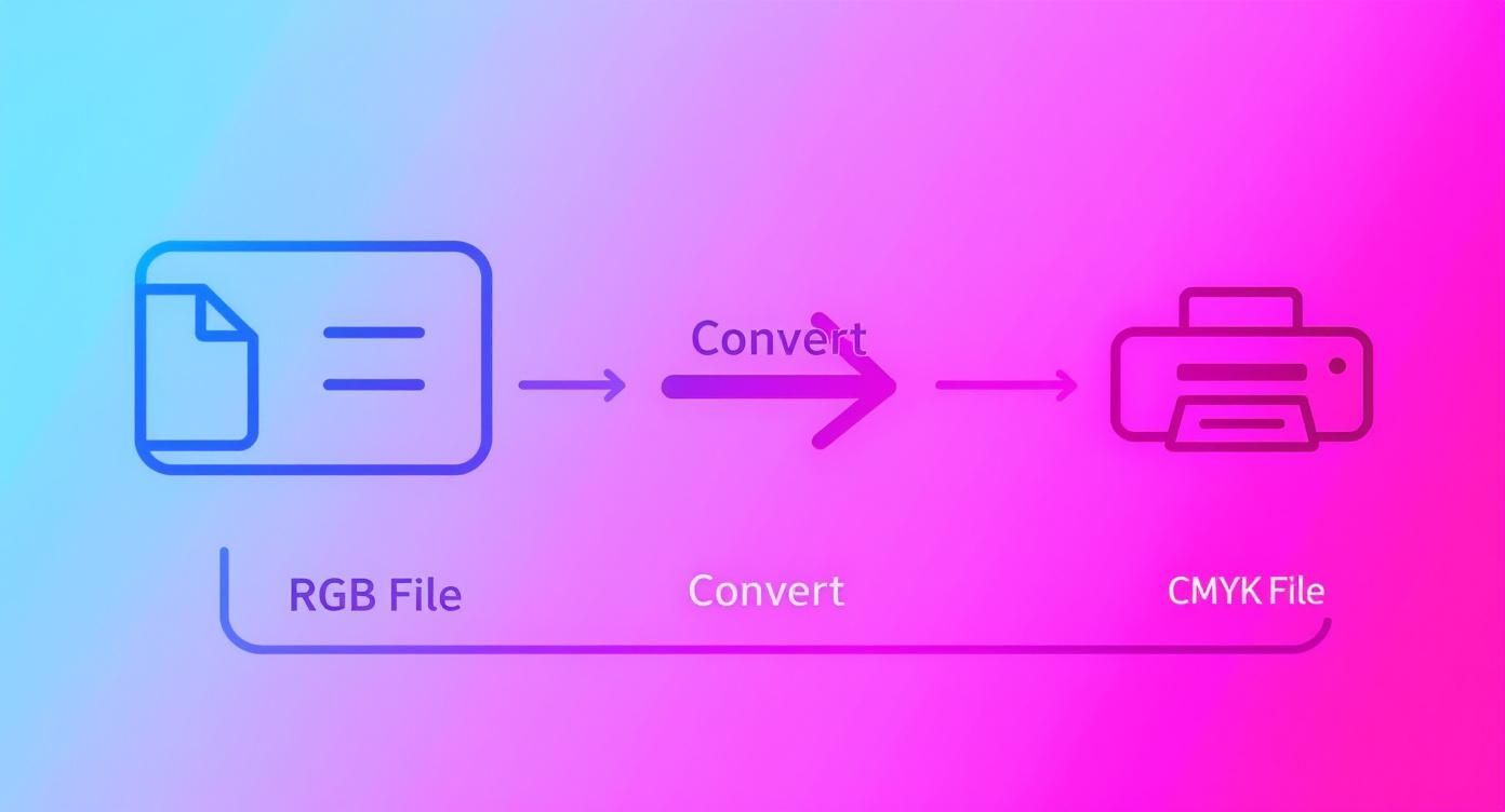
It’s this guided conversion that bridges the gap between your on-screen vision and the final printed garment.
Selecting Your Working RGB Space
Even though your final file needs to be CMYK for print, you'll almost certainly start your design in an RGB workspace. Picking the right one at the very beginning sets a solid foundation for your colours down the line.
For most design work that starts on screen but is destined for print, sRGB IEC61966-2.1 is your safest bet. It's the standard for the web, which means the colours you see on your monitor will be a very close match to what other people see on theirs. It has a smaller range of colours (gamut) than profiles like Adobe RGB, but that's actually a good thing here. It means there are fewer drastic changes when you eventually convert to the smaller CMYK gamut.
The Best CMYK Profiles for UK Print
When it's time to prepare your file for printing here in the UK, you need a CMYK profile that matches the real-world print conditions. The choice really comes down to what the ink is being printed on.
A colour profile isn’t just a setting; it's a simulation. 'Coated FOGRA39' tells Photoshop to show you how your colours will likely look when printed on shiny, coated paper stock—the kind used for magazines and high-quality brochures.
For almost all professional print jobs in the UK, including our DTF transfers, one of two profiles is the industry standard:
- Coated FOGRA39 (ISO 12647-2:2004): This is the workhorse profile for quality printing on coated papers and surfaces. It’s a brilliant all-rounder that delivers rich, punchy results and is supported by virtually every UK printer. For DTF transfers, this profile is a fantastic baseline for getting deep blacks and saturated colours.
- Coated FOGRA51 (PSOCoatedV3): This is a more modern standard, tweaked to better match contemporary printing presses and papers. It can sometimes give you better detail in the shadows and a slightly wider range of colour than FOGRA39.
For designs you send to Psyque, we recommend using Coated FOGRA39. We’ve found it gives the most consistent and reliable results across the huge variety of fabrics we print on. When you're looking for custom T-shirt printers, seeing a clear profile recommendation like this is a good sign that they know their stuff.
How to Assign and Embed Profiles
Once you've settled on your profiles, you need to set them up properly in Adobe. Head over to Edit > Colour Settings. Here you can choose your default RGB and CMYK working spaces for any new documents you create.
Most importantly, when you save your final print-ready file, make sure the "Embed Colour Profile" box is ticked. This little checkbox attaches all the colour information directly to your file. It's what tells our software exactly how to read your CMYK values, removing any guesswork and making sure the colours you signed off on are the ones we print.
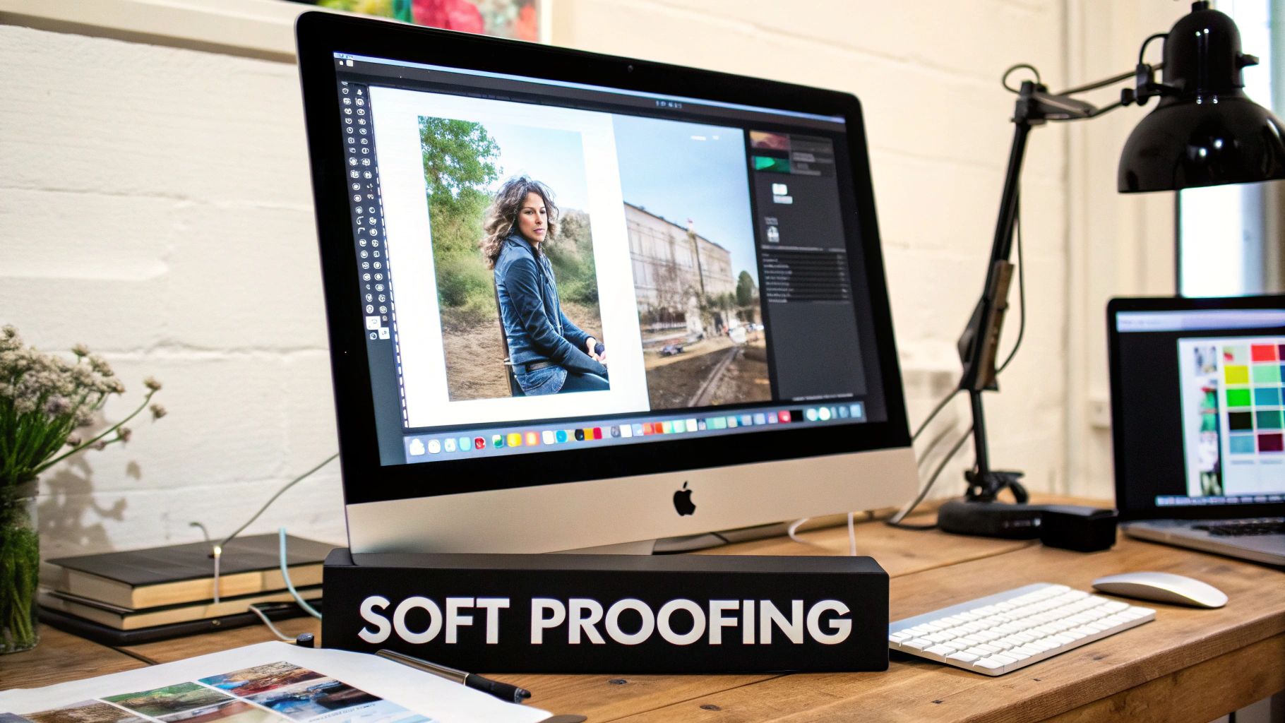
Using Soft Proofing to Preview Your Final Print
Soft proofing is your secret weapon for bridging the gap between a vibrant RGB screen and the final CMYK print. It’s a powerful simulation tool built right into design software that gives you a preview of how your on-screen colours will likely look when printed, helping you sidestep any costly and disappointing mistakes down the line.
This process isn't just a simple colour mode switch. It uses the destination CMYK profile to mimic the real-world limitations of putting ink onto a physical surface. By flicking it on, you can spot potential problem areas—like those punchy electric blues or neon greens that will inevitably become more muted—and make adjustments before your design ever leaves your computer. This proactive step ensures the final product actually matches your creative vision.
Ignoring this step can lead to some serious disappointment. According to a 2020 survey by UK print provider Printful, a massive 65% of UK customers were unhappy with the colour accuracy of printed products they’d submitted as RGB files. This is a huge contrast to just 15% for designs prepared in CMYK. You can learn more about how these colour systems affect print results in their in-depth RGB vs CMYK guide on printful.com.
Setting Up Soft Proofing in Adobe Software
Getting the soft proofing view running in Adobe Photoshop or Illustrator is surprisingly simple, and it gives you an instant, non-destructive preview of the final print. This means you can toggle it on and off to compare the printed simulation against your original RGB artwork without permanently changing anything.
How to Enable Soft Proofing
- Head to View > Proof Setup > Custom… in either Photoshop or Illustrator.
- From the "Device to Simulate" dropdown menu, find and select the correct CMYK profile. For all Psyque DTF transfers, you’ll need to choose Coated FOGRA39.
- Make sure the "Preserve RGB Numbers" or "Preserve CMYK Numbers" box is unticked.
- Set your "Rendering Intent" to Perceptual for photos or Relative Colorimetric for logos with solid brand colours.
- Click "OK" to save these settings.
Once that’s done, you can easily switch this preview on and off with the keyboard shortcut Ctrl+Y (Windows) or Cmd+Y (Mac).
Understanding Key Proofing Options
To get the most accurate simulation possible, there are a couple of extra settings that are absolutely essential. These options fine-tune the preview to more closely match the physical reality of ink on a substrate, giving you an even clearer picture of what to expect.
Soft proofing isn't about making your screen look worse; it's about making it look honest. It gives you a realistic benchmark to work from, turning colour management from guesswork into a predictable science.
Activating these settings will make your on-screen image appear less bright and contrasted, which can be a bit of a shock at first glance. But that’s exactly the point—it's simulating the real-world conditions of print.
- Simulate Paper White: This option adjusts your screen's white point to match the shade of the physical paper or transfer film. Since no print medium is as brilliant as a backlit screen, this gives you a much truer sense of the final print's overall contrast and brightness.
- Simulate Black Ink: This setting simulates the dynamic range of the printer's black ink. It shows you the deepest, darkest black the print process can achieve, which is often a bit less intense than the pure digital black (RGB 0,0,0) you see on your monitor.
Mastering soft proofing is a vital skill for anyone creating designs for physical products, including those who print on transfer paper. It’s the final check that ensures your digital masterpiece translates beautifully into a tangible product you can be proud of.
Your Checklist for Flawless Print-Ready Files
Understanding the theory is one thing, but having a solid, repeatable process is what really delivers professional results, time after time. This section is your final pre-flight checklist. Think of it as a step-by-step guide to make sure every file you send us is technically perfect and ready for DTF printing.
Following these steps is the best way to avoid production delays and ensure the colours on your final garment are as close as possible to what you see on screen. Each setting here is crucial for translating your digital design into a high-quality physical product. Getting them right from the outset is the key to managing the whole CMYK vs RGB for print workflow.
Resolution: The Key to Sharpness
The very first, and most important, check is your file’s resolution. For DTF printing, your artwork absolutely must be set to 300 DPI (Dots Per Inch) at its final print size. If you use a lower resolution, like the web-standard 72 DPI, the final print will look blurry and pixelated, losing all the sharp detail your design deserves.
Always, always double-check this before you even start designing. Trying to upscale a low-resolution image at the end of the process won’t magically add detail back in. It just makes the existing pixels bigger, which often makes the image look soft and out of focus. Starting with a 300 DPI canvas is non-negotiable for professional-grade print quality.
Setting your resolution to 300 DPI from the start gives our printers enough data to reproduce every fine line, subtle gradient, and crisp edge in your artwork with total clarity. It’s the difference between a professional print and a blurry disappointment.
Final Export Settings
Once you’ve finished your masterpiece and soft-proofed the colours, the last step is exporting it correctly. Using the right settings packages your artwork into a file format our print systems can read perfectly, preserving all your hard work. Here’s a quick-reference table for exporting print-ready files from Adobe software.
Final Export Settings for Print-Ready Files
Here is a quick-reference checklist to ensure your files are perfectly prepared for DTF printing.
| Setting | Adobe Illustrator | Adobe Photoshop |
|---|---|---|
| Colour Mode | CMYK | CMYK |
| Colour Profile | Coated FOGRA39 | Coated FOGRA39 |
| Resolution | 300 PPI (Raster Effects) | 300 DPI/PPI |
| File Format | PDF (Press Quality) or EPS | PDF or TIFF |
| Fonts | Outline all text (Create Outlines) | Rasterise all text layers |
| Bleed | Not required for DTF transfers | Not required for DTF transfers |
| Background | Must be transparent | Must be transparent (not white) |
By following this checklist, you take complete control of the production process. You’re not just sending a design; you’re giving us a precise set of technical instructions that we can follow to the letter. This attention to detail is what separates amateur results from professional-grade custom apparel. Use this guide for every project to ensure flawless prints, every single time.
Your CMYK & RGB Questions Answered
Working out the kinks in your CMYK vs. RGB workflow can feel a bit technical, but getting it right is the secret to prints that pop. Let's tackle some of the most common questions designers run into when prepping files, especially for DTF transfers.
What Happens If I Send an RGB File for Printing?
If you send us an RGB file, our printing software will automatically convert it to CMYK before it hits the press. While that might sound handy, it means you've handed over control of your colours.
This auto-conversion is basically a best guess, and it often gets it wrong with out-of-gamut colours. Those vibrant greens, electric blues, and fiery reds you perfected on screen? They're the first to go, often ending up looking dull and disappointingly flat. To make sure your vision comes to life exactly as you see it, it's always better to handle the conversion yourself. That way, you can soft-proof the results and make any tweaks before sending the final artwork.
Should I Design in CMYK from the Start?
That really depends on where the design will live. If you know from day one that your artwork is only ever going to be printed, then yes, starting in CMYK is a great move. It keeps you working within the printable colour range right from the get-go, so you won't fall in love with colours that ink simply can't reproduce. No nasty surprises later on.
But what if your design needs to shine online and in print? In that case, starting in RGB is usually more flexible. You can nail the vibrant digital version first, then create a separate, carefully converted CMYK copy just for your print jobs. This gives you the best of both worlds.
The big takeaway? Let the project's main purpose guide you. If it's a print-only job, start in CMYK. If it's for screens and print, design in RGB first and then create a dedicated CMYK version.
Why Does My Printed Black Look Washed Out?
This is a classic issue, and it almost always comes down to using a standard black made of 100% K ink (C:0 M:0 Y:0 K:100). That's fine for small text, but on larger solid areas, it can look a bit weak and greyish.
To get that deep, saturated finish, printers use what's called a "rich black", which beefs up the black ink with other colours. A common recipe is something like C:60 M:40 Y:40 K:100, but the ideal mix can vary. Your best bet is to ask your print provider for their recommended rich black values to guarantee a solid result.
Can I Convert a CMYK File Back to RGB?
Technically, yes, you can convert a file from CMYK back to RGB. But it won't magically bring back the lost colour data.
When you first converted to CMYK, all that vibrant RGB information outside the smaller gamut was clipped or compressed. It's gone for good. Converting back just takes that limited CMYK palette and displays it within an RGB profile. You won't recover any of the original vibrancy.
At Psyque, we want to help you get stunning results on every single order. Follow these guidelines, and your artwork will be perfectly prepped for our DTF printing services. https://psyque.co.uk