
Printing RGB vs CMYK A Practical Guide for Accurate Colour
Ever had that sinking feeling when the vibrant design you perfected on screen comes out of the printer looking… well, a bit sad and dull? It’s a classic problem, and it’s not your fault. It all comes down to a fundamental clash between how screens and printers handle colour. Getting your head around this is the first step to making sure what you see is what you get.
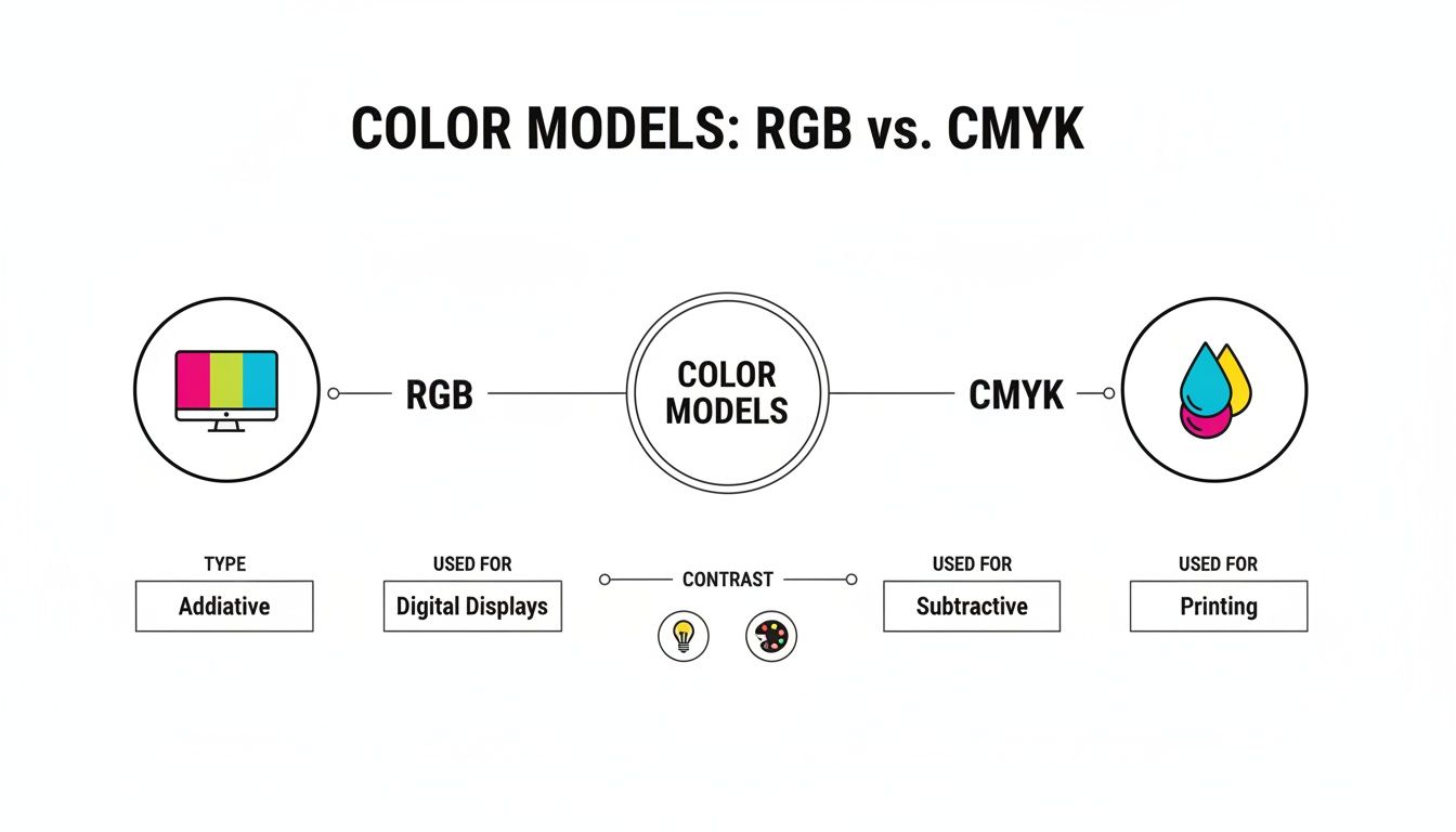
The whole printing RGB vs CMYK debate boils down to one thing: light versus ink. Your monitor, phone, or digital camera uses the RGB (Red, Green, Blue) model, which is additive. It starts with a black screen and adds light to create colour. On the flip side, printers use the CMYK (Cyan, Magenta, Yellow, Key/Black) model, which is subtractive. It starts with a white surface and subtracts light by layering inks.
Understanding the Core Difference Between RGB and CMYK
Think of it this way: RGB is built for digital displays. These devices blast tiny red, green, and blue lights at varying intensities to create a huge spectrum of brilliant colours. When you mix all three at full power, you get pure, bright white. It’s an amazing system for anything that’s going to live on a screen.
This image shows exactly how red, green, and blue light combine in the additive model.
That white area in the middle is the perfect example of the additive process in action—it’s what happens when you combine all that coloured light.
The World of Print: CMYK
Printing is a completely different ball game. Here, we use the subtractive CMYK model. You start with a white canvas—like paper or a t-shirt—and you add layers of ink to absorb, or subtract, light. The colour you end up seeing is whatever light bounces back off the surface. This is why getting to grips with printing on t-shirts in the UK always starts with proper CMYK file prep.
The real headache starts because the range of colours you can create with light (RGB) is way bigger than what you can reproduce with ink (CMYK). That’s precisely why your stunning electric blue logo suddenly looks flat and muted on your business card.
This distinction is mission-critical, especially with the UK's print market growing so fast. As more businesses rely on high-quality printed materials, understanding how to work within CMYK’s limits is what separates the pros from the amateurs.
To put it all into perspective, here’s a quick look at how the two models stack up.
RGB vs CMYK At-a-Glance
This table breaks down the essential differences between the two colour models. It’s a handy reference for remembering which one to use and why.
| Attribute | RGB (Red, Green, Blue) | CMYK (Cyan, Magenta, Yellow, Key/Black) |
|---|---|---|
| Primary Use | Digital screens (monitors, phones, cameras) | Physical print (brochures, apparel, posters) |
| Colour Method | Additive (adds light to create colour) | Subtractive (subtracts light with ink) |
| Colour Range | Wide gamut with vibrant, bright colours | Smaller gamut, limited bright tones |
| Best For | Web design, social media graphics, video | DTF printing, business cards, flyers |
As you can see, they’re designed for totally different worlds. Choosing the right one from the get-go will save you a world of frustration and ensure your final product looks just as you intended.
Why Your Screen Colour Never Perfectly Matches Print
Ever wondered why the stunning design on your monitor looks a bit… flat when it comes out of the printer? The number one culprit behind this disconnect is a little thing called colour gamut.
Put simply, a colour gamut is the complete range of colours a device can show or create. The problem is, the gamut your digital screen (RGB) can display is way bigger than the gamut a printer (CMYK) can reproduce.
Your monitor works by mixing red, green, and blue light. This allows it to create incredibly bright, luminous shades that almost seem to glow—think electric blues, neon greens, and fiery oranges. That huge RGB gamut is perfect for grabbing attention on a screen. Printing, on the other hand, relies on inks absorbing light on paper or fabric, a process that naturally has a much more limited colour range.
This simple infographic breaks down the difference between the additive RGB model for screens and the subtractive CMYK model for print.
You can see how RGB starts with a black screen and adds light to make colours, while CMYK starts with a white surface and subtracts light using ink. This fundamental difference is where all the colour-matching headaches begin.
The Problem of Out-of-Gamut Colours
When your design includes colours that exist in the RGB space but fall outside the CMYK space, we call them "out-of-gamut." When you send that file to print, the software has to figure out what to do with these impossible-to-print colours.
It essentially does its best to find the nearest possible match within its smaller CMYK palette. This conversion process is why your vibrant on-screen design can end up looking disappointingly dull or muted. The software is forced to swap your brilliant hue for a less saturated, toned-down alternative.
The most obvious shifts usually happen with super-saturated blues, greens, and oranges. That electric blue on your screen might turn into a deeper royal blue in print, and a bright lime green could become a more subdued olive tone.
For example, a logo designed with a pure, vibrant RGB blue (#0000FF) will be remapped to a mix of cyan and magenta inks. The final result will still be blue, but it won't have that luminous quality it had on your monitor. This is also a key consideration for more specialised techniques; for instance, the way colours interact with a white ink print base has its own set of rules for gamut and vibrancy.
Getting ahead of these shifts is the secret to managing expectations and getting great results. If you understand from the start that the CMYK gamut is smaller, you can design with print in mind, choosing colours you know will translate well from screen to fabric. It’s a proactive step that prevents nasty surprises and makes sure your final printed piece looks just how you envisioned it.
Getting the RGB to CMYK Conversion Right
Getting your design from the bright, glowing world of a computer screen (RGB) to a physical print (CMYK) is more than just hitting a button. It's a translation. You need to guide that translation, otherwise your software is just going to make its best guess—and that often leads to disappointment and expensive reprints.
Professional design tools like Adobe Photoshop and Illustrator give you the controls to manage this shift properly. Instead of letting the program make assumptions, you can step in and dictate exactly how those vibrant, out-of-gamut colours are handled. This is how you make sure the final product actually matches what you had in mind.
Getting this right is a huge part of the UK's digital printing scene. The market has seen a steady 2.8% compound annual growth rate over the last five years, hitting a value of £1.4 billion. That growth is built on the back of reliably turning digital files into physical goods. While many modern printers use extra inks to expand the CMYK gamut, starting with a clean, controlled conversion is still the bedrock of a good print.
Choosing Your Rendering Intent
When you convert from RGB to CMYK, your software needs a set of rules—a "rendering intent"—to map the colours from the big RGB space into the smaller CMYK one. For print, there are two you really need to know: Perceptual and Relative Colorimetric.
-
Perceptual: This one is all about preserving the overall look and feel. It gently shifts all the colours in your design—even the ones that are already in the CMYK gamut—to make everything fit together smoothly in the new, smaller space. This is perfect for photos, where you want to maintain natural-looking gradients and subtle transitions.
-
Relative Colorimetric: This intent is much more direct. It leaves any colour that's already inside the CMYK gamut completely untouched. It only changes the out-of-gamut colours, shifting them to the nearest possible match right at the edge of the CMYK gamut. This approach is the go-to for logos and vector graphics, where hitting an exact brand colour is non-negotiable.
The Bottom Line: Use Perceptual for photos to keep tones looking natural and smooth. Use Relative Colorimetric for logos and graphics to protect specific brand colours from being altered.
The Role of Colour Profiles
A colour profile is just a small data file that acts like a universal translator for colour. It makes sure your monitor, scanner, and printer are all speaking the same language, so what you see on screen is what you get on paper. Using the right one is essential for getting predictable results.
For most print jobs here in the UK and across Europe, FOGRA39 is the industry standard for coated paper. If you're printing on uncoated stock, it’s usually FOGRA47. Your print provider will always tell you which profile they need, so make it a habit to ask before you send anything over. Embedding the correct profile into your file ensures the printer's software reads your colours exactly as you intended. This step is also a vital part of the workflow for other methods, as we cover in our guide to transfer paper printing.
Once you get a handle on these settings, you stop hoping for good colour and start engineering it. You can build a reliable workflow, set clear expectations with clients, and ensure every single print—whether it's one t-shirt or a thousand flyers—comes out looking just right.
How to Prepare Flawless Print-Ready Files
Getting your head around the RGB to CMYK conversion is a huge step, but it’s just one piece of the puzzle. To create a truly professional, print-ready file, you need to go a little deeper. Think of it as a final pre-flight check that covers all the technical details before your design ever hits the printer—it's what separates the pros from the amateurs.
This final check ensures your file is technically sound, preventing nasty surprises like pixelated images or weird colours that can ruin an entire print run. Let's get it right.
Nail the Resolution
Easily the most common mistake we see in print design is using a low-resolution image. For any physical print, whether it's a tiny business card or a massive banner, your file resolution must be set to 300 DPI (dots per inch).
Graphics made for the web are usually saved at 72 DPI. That looks perfectly fine on a screen, but it will come out blurry and jagged when printed. Always set your document to 300 DPI right from the start to ensure every line, photo, and texture is perfectly crisp and sharp.
Master Your Blacks
In the world of CMYK printing, not all blacks are created equal. It might sound strange, but depending on what you're printing, you'll need to use one of two different types of black to get professional results.
-
Standard Black (100% K): This is as simple as it gets—100% black ink (K) and nothing else. It’s the go-to choice for small text and fine lines because it produces the sharpest possible edges without any risk of colour misregistration.
-
Rich Black: This is a custom mix of all four CMYK inks. A common recipe is C:60, M:40, Y:40, K:100. This blend creates a deep, saturated black that’s perfect for large solid areas, stopping them from looking grey or washed out. Just never use it on small text, or you'll get fuzzy edges.
Using rich black for large backgrounds gives your print a deep, luxurious finish, while sticking to 100% K for text ensures maximum readability. This simple distinction makes a massive difference in the final quality.
Embed Your Colour Profiles
Just as you picked the right CMYK colour profile during the conversion, you have to make sure it’s actually embedded within the final file. Think of it like attaching a set of instructions that tells the printer’s software exactly how to read your colour data.
If you don't embed a profile, the printer’s system has to guess, which almost always leads to unexpected and inaccurate colour shifts. It’s a small step, but it's crucial for consistent colour, especially if you’re sending files to a new print partner. This is a best practice for all types of garment decoration, including when you're creating your own custom t-shirt printing designs.
Choose the Right File Format
The final piece of the puzzle is saving your work in a format that preserves all your hard work. While formats like JPG or PNG are fine for web use, they are a no-go for professional printing because they compress data and lose quality.
The industry standard for print is PDF/X-1a. This specific type of PDF is designed to be a completely self-contained, print-ready file. It flattens transparency, embeds all your fonts and images, and locks in your CMYK colour values. This ensures that what you send is exactly what gets printed. Always double-check with your printer, but PDF/X-1a is almost always the safest and most reliable choice.
Keeping all these files organised is a job in itself. Adopting some solid digital asset management best practices can make a huge difference to your workflow.
Using Proofs to Guarantee Colour Accuracy
After all the careful prep work—from converting colours to formatting your files—there's one last quality control step that makes sure it all pays off: proofing. Think of it as your final chance to spot any weird colour shifts before you commit to a full print run, saving yourself from the headache and cost of a reprint.
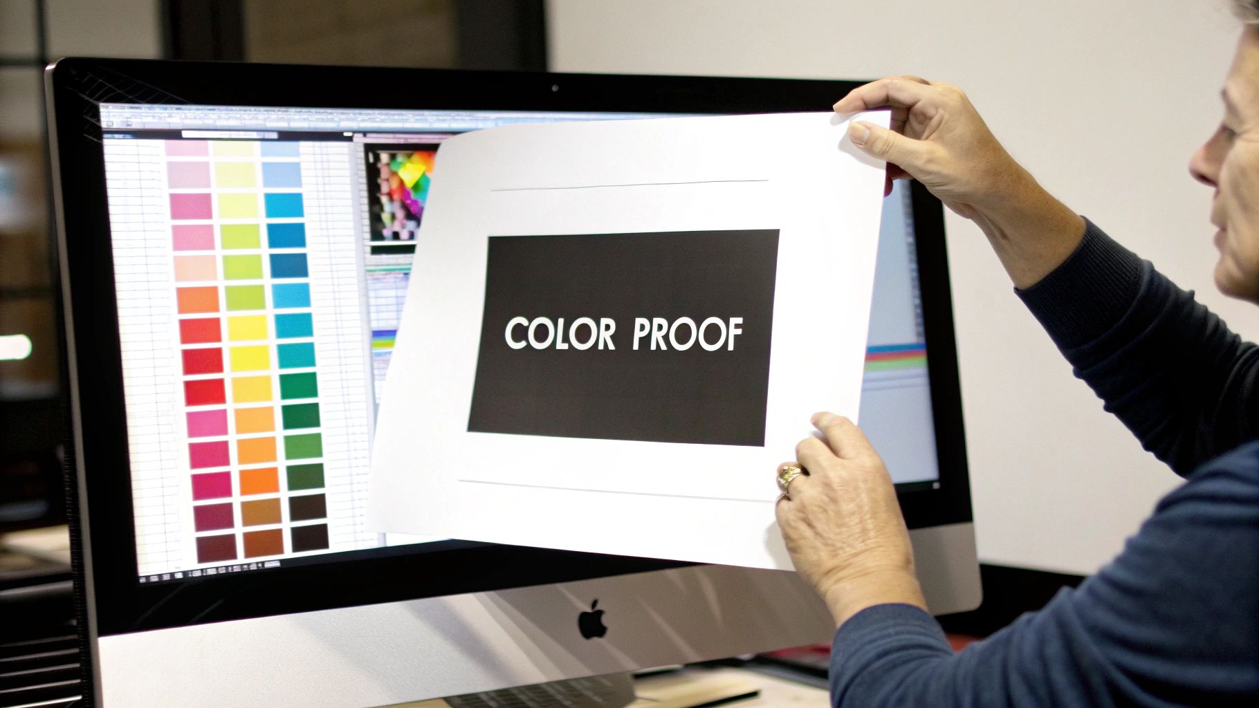
The easiest way to do this is with soft proofing, a feature built right into professional design software like Adobe Photoshop. It uses your monitor to simulate how your design will look once it's printed in the CMYK colour space. If you have a properly calibrated monitor, it's a quick and powerful way to preview any potential gamut issues and make final tweaks without spending a penny.
Digital vs Physical Proofs
While soft proofing is a fantastic tool for day-to-day work, it can’t fully capture the texture and light absorption of a real-world material. That’s where a hard proof—a physical test print—becomes absolutely essential for certain projects. It’s a single, calibrated print of your design, made using the same technology as the final run.
So, how do you choose? It really comes down to balancing your budget against how critical perfect colour accuracy is for that specific job.
For projects where colour is absolutely mission-critical—think branding materials with specific corporate colours, high-end art prints, or large-scale retail packaging—a hard proof is non-negotiable. It is the only way to be 100% certain of the final result.
This is becoming even more important as the UK printing industry pushes for sustainability. Printers are increasingly using vegetable-based inks and recycled papers to meet environmental standards, which can affect how CMYK colours appear. Accurate proofing is the only way to guarantee your intended outcome on these eco-friendly materials, a trend noted in recent reports on the UK’s custom printing market.
When to Choose Each Proofing Method
So, how do you decide which proofing method is right for your project? The answer depends entirely on the context and what's at stake.
Here’s a practical guide to help you choose:
-
Use a Soft Proof When:
- You’re working on internal projects where colour isn't super sensitive.
- You’re creating digital mock-ups or initial drafts for client approval.
- The budget is tight, and a slight colour variation is acceptable.
-
Invest in a Hard Proof When:
- You're printing brand-critical materials like logos or business cards where colour consistency is everything.
- The project involves a large, expensive print run where mistakes would be costly.
- You’re printing on a new or unique material for the first time, like a specific fabric for apparel. For example, before you order DTF prints for a full clothing line, getting a single transfer pressed onto your chosen garment is the best way to verify the final look and feel.
At the end of the day, proofing is your insurance policy against disappointment. A quick soft proof will catch most issues, but for those jobs that simply have to be perfect, a physical hard proof is an investment that always pays for itself.
Your RGB & CMYK Questions Answered
Even after getting your head around the theory, a few practical questions always seem to crop up. Here are some of the most common ones we hear, with straightforward answers to keep your print projects on track.
Can I Just Send an RGB File to Print?
Technically, yes, you can send an RGB file to most modern printers, but it’s a gamble you shouldn't take. When a printer receives an RGB file, its software has to perform an automatic, on-the-fly conversion to CMYK. It’s essentially making its best guess about how to translate your screen colours into ink.
This almost always leads to disappointing colour shifts. To get professional, predictable results, you should always handle the conversion to CMYK yourself before you even think about printing.
Why Do My Blues Keep Printing Purple?
Ah, the classic blue-to-purple problem. This is one of the most frustrating issues in printing, and it happens because of how differently screens and inks create the colour blue. Your screen uses light to create a pure, vibrant blue with ease. In print, blue is made by mixing cyan and magenta inks.
If the magenta level is too high after conversion, or if the specific blue you picked on screen is outside the CMYK gamut, the final print will lean heavily into a purple hue.
Our advice: Manually tweak your CMYK values after converting. Try reducing the magenta component while nudging up the cyan. This can often pull the colour back towards the true blue you were aiming for. Always use soft-proofing to check your adjustments before committing.
What’s the Best File Format for Printing?
For any professional print job, PDF/X-1a is the gold standard. While you might work in formats like AI (Adobe Illustrator) or EPS, a PDF/X-1a is the perfect final package to send to your printer.
It’s completely self-contained, meaning it embeds all your fonts, images, and—most importantly—the CMYK colour profile. This ensures that what you see on your screen is exactly what the printer sees. Avoid sending formats like JPEGs or PNGs; they’re designed for web use and will give you a lower-quality result.
Should I Just Design in CMYK from the Start?
It sounds logical, but it’s actually better practice to start your design in the RGB colour space. The RGB gamut is much larger, giving you a wider range of vibrant colours to work with and more creative flexibility. This is especially useful if the design might also be used online, like on a website or social media.
The best workflow is to design in RGB, then save a separate copy that you convert to CMYK as a final step before printing. This approach gives you a vibrant master file for digital use and allows you to make controlled, specific adjustments for the print version.
Ready to see your designs come to life with stunning colour accuracy and professional quality? At Psyque, we specialise in high-fidelity DTF printing that makes your apparel pop. Let us handle the technical details so you can focus on creativity. Explore our custom printing services today!