
T Shirt Design Logos That Actually Sell
Before you even dream of firing up your design software, let’s get one thing straight: a killer t-shirt logo starts with an idea, not a graphic. The designs that truly sell, the ones that people feel a connection to, aren't just cool images. They tell a story. This is the foundation that separates a shirt that flies off the shelf from one that gathers dust.
Crafting a T-Shirt Logo That Actually Connects
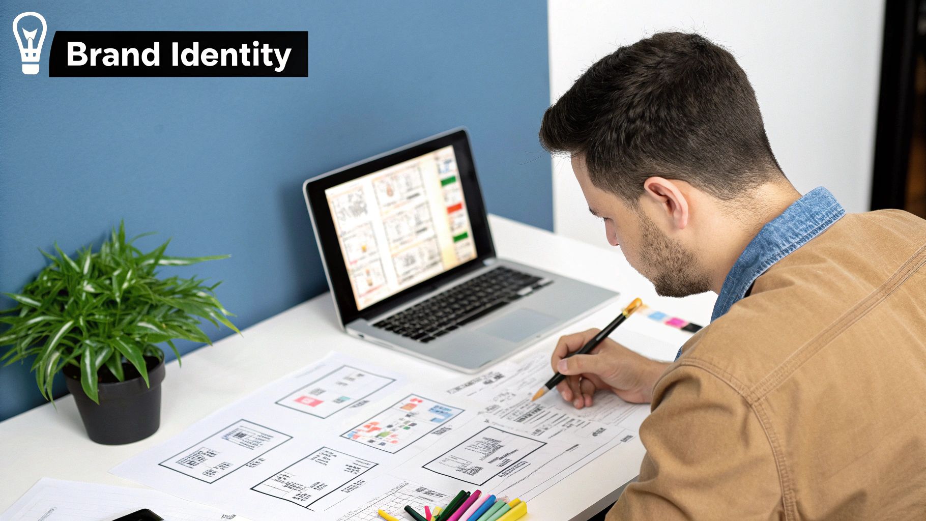
It's tempting to jump straight into sketching, but the most successful designs are born from a rock-solid concept. Seasoned designers know the real work starts by figuring out the "why" and the "who" behind the shirt. This early planning is what gives a logo its soul and, ultimately, its selling power.
Think about it. Are you designing for a local punk band or a corporate wellness retreat? The answer changes everything. The band logo might be all gritty, hand-drawn fonts and raw imagery. The corporate one? Probably clean lines, a calm colour palette, and a professional typeface. Both are logos for t-shirts, but they speak completely different languages to different tribes.
Define Your Core Message and Audience
First things first: nail down the brand's core message. What's the story you're trying to tell? What's the vibe—playful, serious, rebellious, sophisticated? Get this clear before you do anything else.
Once the message is locked in, you need to know exactly who you're talking to. Don't just guess. Dig into the details:
- Age and Gender: A design for a teenager looks worlds apart from one aimed at a middle-aged professional.
- Interests and Hobbies: What does your audience geek out on? Tap into shared passions—gaming, hiking, vintage cars—to create an instant bond.
- Values and Beliefs: Does your crowd care about sustainability, humour, or community? Weaving these values into your design builds loyalty.
A logo isn't just a graphic; it's a shortcut to a story. By focusing on your audience and message first, you make sure the story you're telling is one people actually want to hear—and, more importantly, wear.
This strategic thinking has never been more critical. The demand for personalised gear is exploding. The UK custom t-shirt printing market hit £157 million in 2023 and is on track to nearly double by 2030. People are hungry for unique designs that mean something.
By getting the narrative right and truly understanding your audience, you're not just making a pretty picture. You're creating a t-shirt logo that connects, communicates, and converts. For more on locking in your target customer, check out our guide on https://psyque.co.uk/blogs/news/social-media-marketing-for-fashion.
Choosing the Right T-Shirt Design Software
Picking the right software for your t-shirt logos can feel like a massive decision, but it’s way simpler than it seems. The real goal isn’t to find the single "best" program out there, but the one that actually works for you—your skills, your budget, and the kind of art you want to unleash. Your choice here will define how you create and what your final print actually looks like.
The whole debate boils down to two main types of software: vector and raster. Getting your head around the difference is mission-critical if you want pro-level prints.
Vector vs Raster: The Designer’s Dilemma
Vector software is the undisputed king for logo design. Think tools like Adobe Illustrator or Affinity Designer. These programs use maths to create lines and shapes, which sounds boring but is actually a superpower. The massive advantage? Infinite scalability. You can blow up a vector logo from the size of a postage stamp to a giant billboard, and it will stay perfectly crisp. No blurriness, ever.
Raster software, on the other hand, is all about pixels—those tiny squares of colour that make up a digital image. Programs like Adobe Photoshop, Procreate, and GIMP are built on pixels. This makes them incredible for creating rich textures, detailed illustrations, and photorealistic art. The catch is that raster images are stuck at their original resolution. Enlarge them too much, and you get a blurry, pixelated mess on the final t-shirt.
If you're designing logos for t-shirts, always try to start with a vector mindset. It gives you the most freedom for printing and future-proofing your brand. Raster is awesome for artistic, one-off graphics, but you have to be super careful with your file setup.
Let’s get practical and compare the tools you’ll actually be using.
Comparing Popular T-Shirt Logo Design Tools
This table breaks down the key differences between vector and raster software to help you make an informed choice for your design needs.
| Software Type | Popular Tools | Ideal For | Key Strength |
|---|---|---|---|
| Vector | Adobe Illustrator, Affinity Designer, CorelDRAW | Logos, typography, and bold graphics that need resizing. | Scalability Lines remain perfectly sharp at any size. |
| Raster | Adobe Photoshop, Procreate, GIMP | Detailed illustrations, painted textures, and photo-based designs. | Artistic Detail Allows for rich textures and complex colouring. |
Ultimately, choosing between them depends entirely on what you're trying to achieve with your design.
Finding Your Perfect Fit
For most classic t-shirt logos built around text or clean graphics, a vector program like Adobe Illustrator is the go-to. It gives you surgical precision over lines, shapes, and typography—exactly what you need for sharp, professional branding.
But if you’re creating something with a more hand-drawn, painterly vibe for a specific graphic, a raster tool like Procreate on an iPad is a fantastic, intuitive choice. It feels like you're actually drawing, which is perfect for more organic designs.
So, what about easy-to-use tools like Canva? Canva is great for throwing ideas together and making quick mock-ups. But for a final, print-ready file, especially for something more complex like a polo shirt, you'll want to rebuild it in professional software. This ensures you have total control over the file output and print quality. To see how different designs look on specific garments, check out our guide on polo tee shirt design.
The best software is simply the one that lets you bring your vision to life without fighting the tech. Don't be afraid to use free trials and see which one feels right for you.
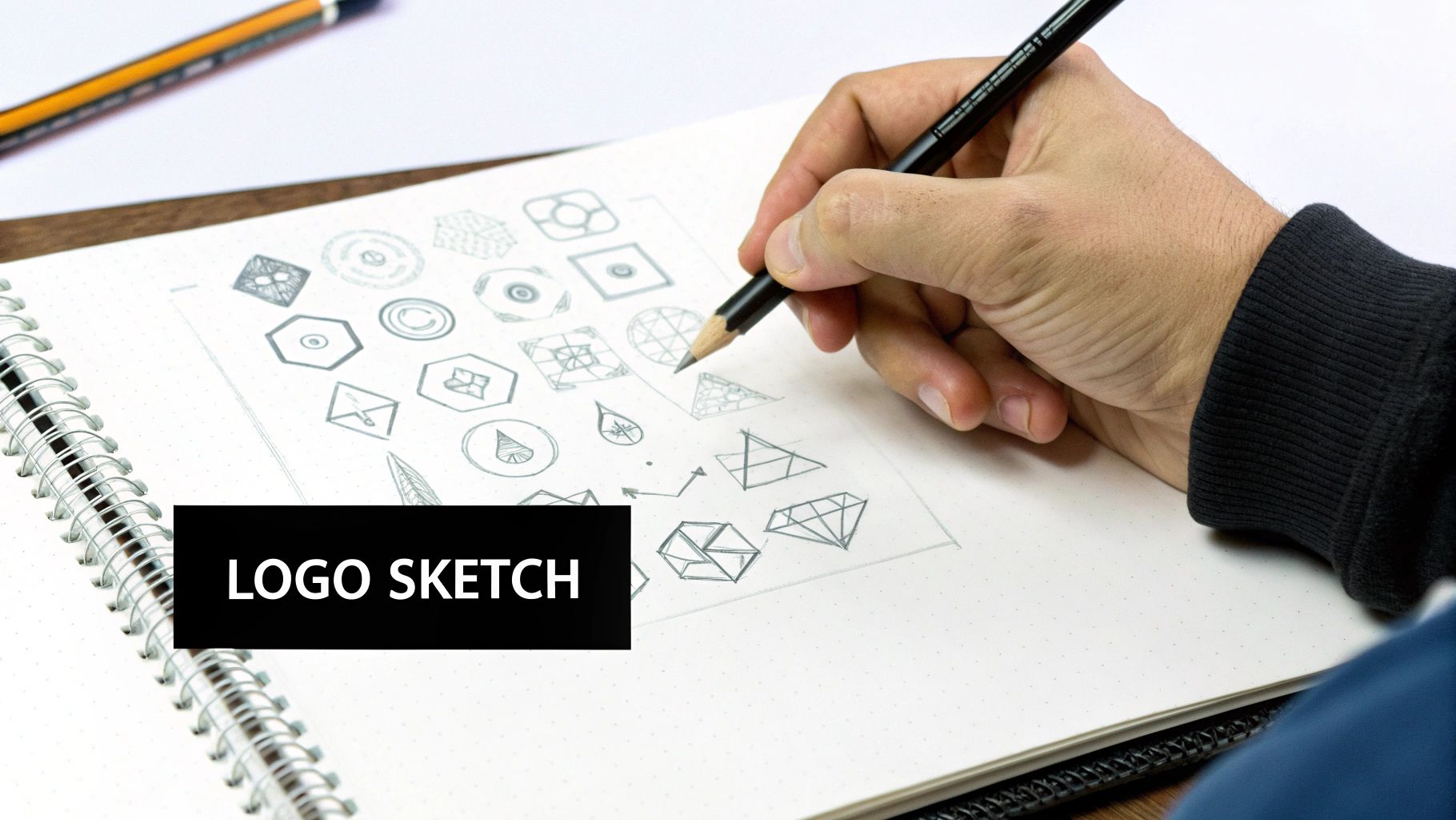
From Napkin Sketch to Polished Digital Logo
The most iconic t-shirt design logos almost never start life on a screen. Forget pixels for a minute. They start as messy scribbles on a napkin, rough shapes in a notebook, or frantic sketches on a whiteboard. This is where the real magic happens, letting you throw ideas around without the rigid constraints of design software.
Before you even think about firing up your laptop, grab a pen and paper. Seriously. This simple act unlocks a different part of your brain, encouraging raw, unfiltered creativity. Don't aim for perfection here; the goal is to get a ton of ideas down, no matter how wild they seem. Try rapid-fire brainstorming techniques like mind mapping or word association to get past the obvious stuff.
Let's say you're designing for a streetwear brand inspired by Japanese mythology. Your mind map might explode from "Kitsune" to "nine tails," "trickster spirit," "fox fire," and "urban legends." Each of those branches is a potential visual direction just waiting to be sketched out.
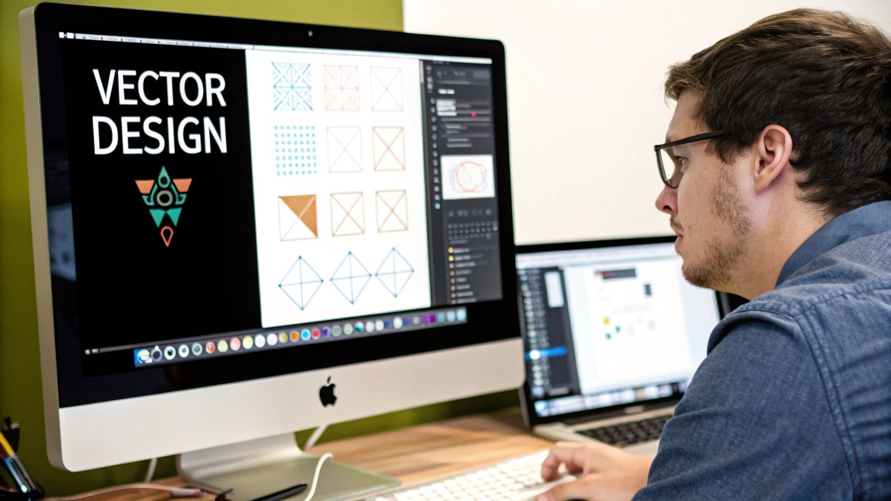
Building Your Digital Foundation
Once you've got a handful of sketches that feel strong, it's time to bring them into the digital world. This is where you hammer those raw ideas into a polished, professional logo. Three things will make or break your design at this stage: typography, colour, and composition.
Finding the Right Font
Your choice of font does a massive amount of heavy lifting. It sets the tone instantly.
- Serif Fonts: These feel classic, traditional, and trustworthy. Think university apparel or heritage brands.
- Sans-Serif Fonts: Modern, clean, and direct. They're incredibly versatile and perfect for tech companies, minimalist brands, and most modern streetwear.
- Script Fonts: Can range from elegant and formal to casual and hand-drawn. They add a personal touch but can be a nightmare to read if you overdo it.
- Display Fonts: These are the loud ones—bold, unique, and full of personality. They're perfect for making a statement but use them sparingly for maximum impact.
Don’t just pick a font you think looks cool; pick one that speaks the same language as your brand. A playful, bubbly font will feel completely out of place on a serious, corporate logo, and vice versa.
Choosing Colours That Pop
Colour is pure emotion. It’s often the very first thing people notice. When you’re picking a palette, you have to think about how those colours will actually look on a garment. A colour that looks electric on a white screen might look muddy and dull on a black or navy t-shirt. Always test your combos against common fabric colours.
A tight palette of two to three colours is usually far more impactful—and cheaper to print—than a design with a dozen different shades. This forces you to be more creative and often results in a stronger, more memorable logo.
Nailing the Composition
Finally, you need to arrange your elements—text, graphics, shapes—into a balanced and visually pleasing layout. Pay close attention to negative space, which is just the empty area around your design. Giving your logo room to breathe makes it feel more professional and stops it from looking like a cluttered mess on the shirt.
Think about the logo’s placement and scale on the final product. A design that looks amazing as a huge centre-chest print might need to be simplified to work as a small pocket logo. For more specific insights on bringing your ideas to life through print, we’ve got a guide on creating personalised t-shirts on our blog. This whole process—sketching, refining, and balancing—is how a simple idea becomes wearable art.
Preparing Your Logo for Perfect Printing
A killer design can fall completely flat if the technical prep is sloppy. This is where professional t shirt design logos pull away from the amateur stuff. Getting your file ready for Direct-to-Film (DTF) printing isn't rocket science, but it demands attention to detail if you want to avoid costly, soul-crushing reprints.
The whole point is to give your printer a file so clean they don’t even have to think. No missing fonts, no weird colour shifts, and definitely no blurry edges. It all starts with speaking the language of print-ready files.
This quick infographic breaks down the core creative steps that should happen long before you even touch the technical file prep.
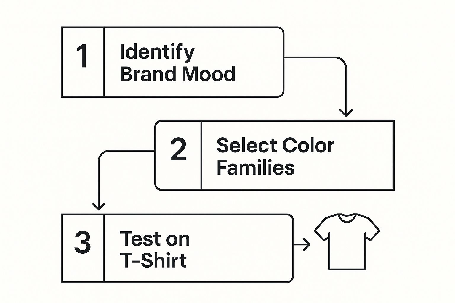
As you can see, figuring out the brand mood and picking your colours comes way before the design is finalised and slapped on a T-shirt mock-up.
Vector Files Are Your Best Friend
When it comes to logos, vector is the undisputed champion. Seriously. Formats like AI (Adobe Illustrator), EPS, and SVG are built on maths, not pixels. This means your logo can be scaled from a tiny sleeve detail to a massive back print with zero loss of quality. It will always be perfectly sharp.
Now, if your design has photographic bits or complex textures, a high-resolution raster file is your next best bet. For this, you’ll need a PNG file with a transparent background. Critically, it must be saved at a minimum of 300 DPI (dots per inch) at the final print size. Anything less will look like a soft, pixelated mess.
Technical Checks Before You Export
Before you hit 'Save As…', run through this quick checklist. Nailing these details is the difference between a flawless print run and a frustrating one.
- Convert Fonts to Outlines: This is non-negotiable. Converting text to shapes (or 'outlining') locks the font data into the file. It stops the printer's computer from swapping your cool, carefully chosen typeface for a default font if they don't have it installed.
- Set the Correct Colour Mode: Your screen shows you colours in RGB (Red, Green, Blue), but printers work in CMYK (Cyan, Magenta, Yellow, Black). It's best to design in CMYK from the start. This gives you a much more accurate preview of how the colours will look on fabric and helps you avoid nasty surprises.
- Embed Your Images: If you've dropped any raster images into your vector design, make sure they are embedded directly into the file, not just linked. This packages everything up neatly so nothing goes missing when you send it off.
A printer’s worst nightmare is getting a file with missing fonts or low-res images. Taking two minutes to outline your text and double-check your DPI will save you days of back-and-forth emails and the cost of a reprint.
The hunger for high-quality custom gear is only getting bigger. By 2025, the UK t-shirts market is projected to hit a revenue of around US$2.42 billion, which means a massive need for well-prepared, personalised designs.
Getting these technical steps right ensures your design looks as good on a tee as it does on your screen. To see how these files translate into real-world products, check out our deep dive into custom t-shirt printing. It’s the final, crucial step in bringing your vision to life.
Don't Let These Common T-Shirt Design Pitfalls Wreck Your Work
Learning from someone else's mistakes is way faster (and cheaper) than making your own. Even the most killer ideas for t-shirt design logos can crash and burn if you fall into one of the usual traps. Let's walk through the slip-ups that can turn a masterpiece into a mess when it hits fabric.
One of the biggest culprits? Overly complex designs. That logo loaded with a dozen colours, slick gradients, and tiny details might look incredible on a 4K monitor, but it often turns into a muddy, unreadable blob on a T-shirt. Simplicity is your best weapon here. A clean, bold design with a tight colour palette always hits harder and is way more cost-effective to print.
Another major hurdle is forgetting about the legal stuff. Slapping copyrighted images or trademarked slogans on your tees is a one-way ticket to trouble. Stick to creating original artwork or using elements you have a rock-solid commercial licence for. Seriously, don't skip this.
Overlooking Font and Placement Details
Bad typography choices can make a great design look instantly cheap. Sure, a font might look cool on its own, but does it actually fit the brand's vibe? More importantly, can you read it from a distance? Ditch the super decorative or thin fonts—they tend to break up or disappear completely once printed.
Where you put the logo is just as crucial. Awkward placement can kill an otherwise solid design. The standard centre-chest spot is a classic for a reason, but don't be scared to experiment with the left chest, sleeve, or upper back. Just make sure it looks balanced and deliberate, not like an accident.
Think of a T-shirt as a moving canvas. A logo needs to look good and be legible not just laid flat, but when someone is actually wearing it. Always test your placement on mockups to avoid designs that sit too low or get warped by the body’s natural curves.
Copyright and Originality Issues
Creating genuinely original work is non-negotiable. It’s not just about avoiding lawsuits; it’s about carving out a unique identity for your brand. Leaning on generic stock art or jumping on every fleeting trend will make your designs completely forgettable. Dig deep into your niche, get a feel for its visual language, and then find a fresh angle that makes your stuff stand out.
People are hungry for unique gear. The custom artwork scene is projected to explode by 12.1% between 2025 and 2030, proving just how much value there is in original, personalised clothing. You can get more insights on this trend by digging into the full analysis of the T-shirt industry on printful.com.
Nailing these details is about more than just design chops; it's about understanding the whole process, from the initial idea to the final heat press. To make sure your perfectly crafted logo transfers flawlessly onto the shirt, get familiar with the technical side. Check out our heat press temperature guide for the essential tips you need for a durable, pro-level finish. Sidestep these common pitfalls, and you'll turn potential failures into wearable art that actually connects with people and sells.
Your T-Shirt Design Questions Answered
When you're in the middle of a project, the small details can feel like the biggest hurdles. Questions about t shirt design logos always pop up, and getting the right answers can save you from a world of printing headaches and wasted money.
Let’s cut through the noise and tackle the common queries designers get stuck on. Getting these things right is what separates a sharp, professional-looking tee from something that just looks… off.
What’s the Best File Format for T-Shirt Logos?
For logos, vector files are king. No contest. Formats like AI (Adobe Illustrator), EPS, and SVG are built to be scaled up or down without losing a shred of quality. This means your logo will stay razor-sharp, whether it’s a tiny chest hit or a massive print across the back.
But what if your design has photos or complex textures? Then you’re dealing with a raster file. For that, you absolutely must send your printer a high-resolution PNG file (at least 300 DPI) saved with a transparent background. Don’t skip that last part.
How Many Colours Should My T-Shirt Logo Have?
Honestly, less is almost always more. Sticking to 1–3 colours is a smart move, especially if you’re considering screen printing. Not only does it create a cleaner, more impactful design that’s easy to read from a distance, but it also keeps your printing costs from spiralling out of control.
While modern printing like DTF gives you the freedom to go wild with colours, a limited palette forces you to create a stronger design. It makes you focus on the fundamentals—shape, form, and composition—which are the true building blocks of an iconic logo.
How Do I Make Sure My Logo Design Is Unique?
True originality starts before you even open your design software. Do your homework. Dive deep into your niche and see what everyone else is doing. Your goal is to spot the overused trends and tired clichés so you can run in the other direction.
To make sure your design actually stands out:
- Ditch Generic Stock Art: Step away from the common clipart and overused design elements. They’ll make your brand look like a cheap knock-off.
- Sketch It Out First: Starting with pen and paper often sparks more creative and organic ideas than staring at a blank screen.
- Tell a Real Story: Build a concept that genuinely reflects your brand’s personality and what you stand for. Authenticity can’t be faked.
Of course, once you’ve created the perfect tee, you need to get it in front of the right people. Having a killer design is only half the battle; knowing how to market it online is what makes it sell. It pays to understand what goes into a winning PPC strategy for e-commerce.
Ready to see your unique vision printed with insane detail and vibrant colour? At Psyque - DTF Print & Press, we live for high-quality DTF printing that brings every element of your design to life. Explore our collections and custom printing services today!
more articles:
Fast Next Day Delivery Personalised T Shirts
Your Guide to T Shirt Custom Printing
Design Your Own Hoodie UK