
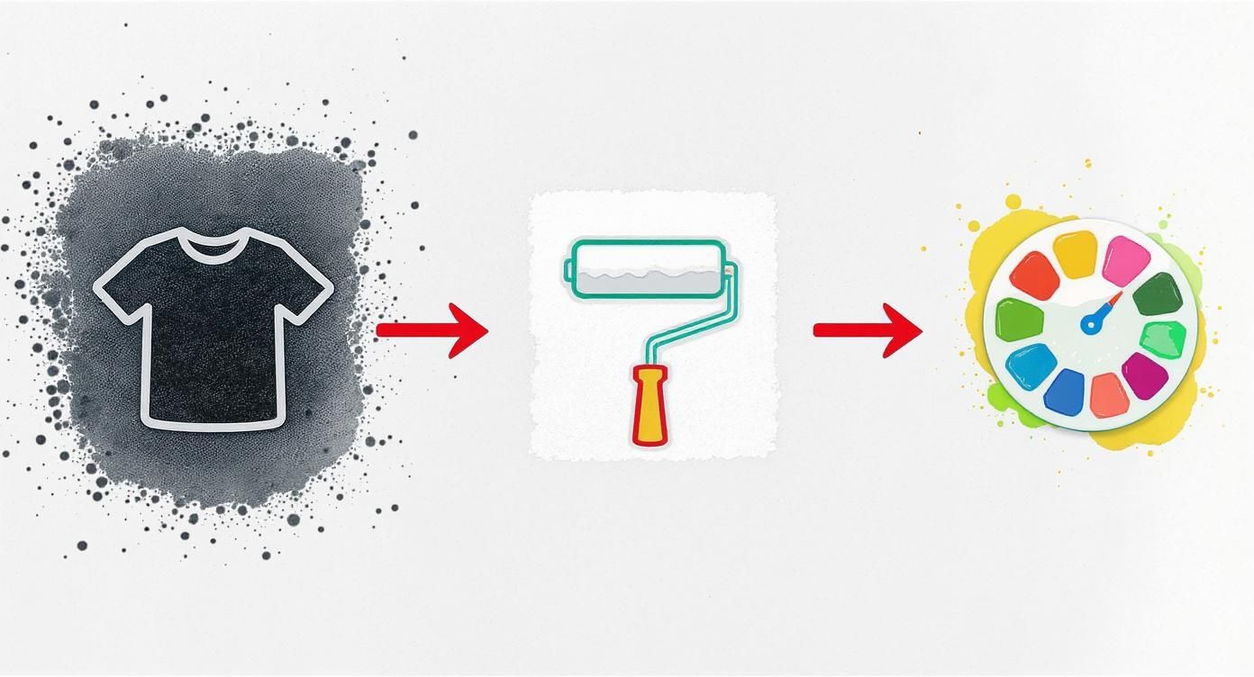
A Practical Guide to White Ink Print Technology
Ever tried drawing on black paper with a normal set of pens? The colours just sink in, looking dull and lifeless. Standard printers face the exact same problem – they're built assuming the paper (or fabric) is white. This is where white ink printing completely rewrites the rulebook.
It’s the secret sauce behind those crisp, vibrant designs you see on dark t-shirts, clear window decals, and all sorts of coloured merchandise. Without it, printing on anything other than white results in muddy, washed-out images that just don't look professional.
The Power of a Solid Foundation
At its heart, the concept is simple but incredibly effective. By printing a layer of opaque white ink first – a technique known as creating a white underbase – we create the perfect blank canvas for the coloured inks to go on top. This ensures every single hue stays true to its original shade, popping with vibrancy no matter the colour of the material underneath.
This technology opens up a whole new world of creative freedom. For designers, brands, and anyone creating custom gear, it means no more being limited to white or light-coloured items.
To give you a clearer picture, here’s a quick summary of what makes white ink printing so valuable.
White Ink Print At a Glance
| Key Feature | Primary Benefit | Ideal For |
|---|---|---|
| Opaque White Ink | Creates a solid base on dark or coloured surfaces. | Dark t-shirts, hoodies, and coloured fabrics. |
| Full Colour Vibrancy | Allows CMYK colours to appear bright and true. | Detailed, multi-coloured graphics and photos. |
| Material Versatility | Works on fabrics, plastics, and transparent items. | Custom apparel, stickers, and promotional goods. |
| Professional Finish | Delivers high-quality, retail-ready results. | Brands, artists, and businesses needing premium products. |
This guide will walk you through everything you need to know to get the most out of this process. We’ll cover all the important stuff, like:
- How Direct-to-Film (DTF) printing uses white ink so effectively.
- Getting your artwork files prepped for flawless results.
- Choosing the right materials for your projects.
- Making sure your printed items last as long as possible.
The demand for this kind of quality is booming. The UK's digital printing market, which relies heavily on advanced methods like this, pulled in $2,422.7 million in 2023 and is set to keep growing. This isn't just a niche technique anymore; it's becoming the standard for high-quality customisation. You can dig deeper into these market trends over at Grandviewresearch.com.
Think of it like this: A white underbase is to a dark t-shirt what a primer is to a dark wall. You wouldn't paint a bright yellow directly onto a black wall and expect it to look good. You'd prime it with white first. White ink printing does the exact same thing for your designs.
Ultimately, understanding white ink is a must for anyone serious about producing top-tier custom apparel. Whether you’re putting a bold logo on a black hoodie or a colourful illustration on a navy tote bag, this is what separates an amateur-looking job from a truly professional product.
To see how these principles come to life on actual garments, take a look at our complete guide on custom t-shirt printing.
How Does White Ink Printing Actually Work?
To really get why white ink prints look so good, it helps to peek behind the curtain at the clever process that makes it all happen. While there are a few ways to get the job done, Direct-to-Film (DTF) has become the go-to method, especially for custom clothing. It’s a multi-step journey that turns a digital file into a tough, brilliant print that feels great to wear.
Forget what you know about regular paper printing. This is more like creating a high-end, flexible sticker that literally becomes part of the fabric. Every step is carefully designed to build up the final image, layer by layer.
The Direct-to-Film Journey Step-by-Step
The DTF process is a finely tuned sequence. It’s not about just spraying ink onto a shirt; it’s about crafting a perfect transfer that can stick to almost anything.
-
Printing the Colour Layer First: It all starts with a special DTF printer putting down your design’s colours (Cyan, Magenta, Yellow, and Black) onto a sheet of clear transfer film. This is the part of your graphic you’ll see, but it’s printed in reverse.
-
Adding the White Ink Foundation: Right after the colour goes down, the printer lays a perfectly matched layer of opaque white ink on top. This white layer is the secret weapon—it’s going to be the backing for your design once it’s on the garment.
-
Applying the Adhesive Powder: While the ink is still wet, the film is dusted with a fine polymer powder. This special powder sticks to every bit of ink, both colour and white. Think of it as the glue that will bond your design to the fabric.
-
Curing the Transfer: Next, the powdered film is sent through a heat tunnel. This melts the adhesive powder and fuses it with the ink, creating a single, stable, and flexible transfer sheet. Now, it’s ready for the main event.
-
The Final Heat Press: The finished transfer is placed onto the garment—a t-shirt, hoodie, you name it—and pressed using a heat press. The heat and pressure activate the adhesive, permanently bonding the ink into the fabric’s fibres. After a quick cool down, the clear film is peeled away, leaving just the crisp, vibrant design.
This process is all about building layers to make colours pop, especially on dark fabrics.
As you can see, that white ink layer acts as the ultimate primer. It creates a solid, bright canvas that allows the colours on top to shout, not whisper.
How DTF Stacks Up Against Other Methods
DTF isn't the only game in town for white ink, but its incredible versatility is what really sets it apart. Looking at the alternatives makes it clear why it’s become such a favourite for custom gear. If you’re curious about printing ink straight onto clothing, you can dive deeper in our guide to direct-to-garment printing to see how they differ.
To make things simple, here’s a quick rundown of how the main white ink technologies compare.
Comparing White Ink Printing Methods
| Printing Method | How White Ink Is Used | Best Substrates | Key Advantage |
|---|---|---|---|
| Direct-to-Film (DTF) | Printed as a backing layer on a transfer film. | Cotton, polyester, blends, denim, canvas. | Supremely versatile; works on a huge range of fabrics and colours. |
| UV Printing | Applied directly to the surface and cured instantly with UV light. | Rigid materials like wood, acrylic, metal, and glass. | Fantastic for non-fabric items and creating cool textured effects. |
| Screen Printing | Pushed through a mesh screen as a thick base layer. | Primarily cotton and some blends. | Super cost-effective for very large runs of simple designs. |
Screen printing has been the king for massive bulk orders and UV printing owns the world of hard goods, but DTF hits a sweet spot right in the middle. It brings a level of material flexibility that was once a pipe dream, letting you put brilliant, full-colour designs on everything from dark polyester sportswear to tough canvas bags.
This adaptability is exactly why the white ink print process, powered by DTF, is the modern choice for brands and creators who refuse to compromise on quality or creativity.
Unlocking Vibrant Colours with a White Underbase
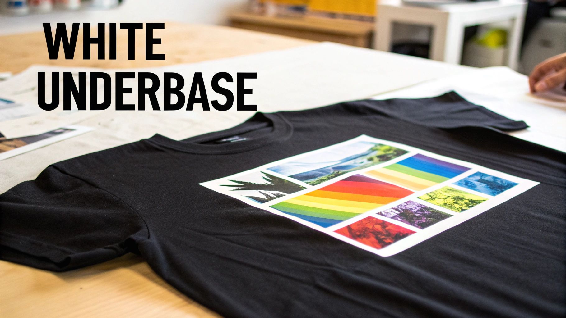
This is where the real magic of white ink printing happens. Ever tried using a yellow highlighter on a black piece of paper? The colour just vanishes, looking dull and murky. That's exactly what happens when you print standard inks straight onto a dark t-shirt—the fabric's colour swallows the light, turning your brilliant design into a muddy disappointment.
The answer is a special foundational layer called a white underbase. This is a solid, opaque layer of white ink that gets printed onto the garment first, perfectly matching the shape of your artwork. Think of it as a primer, creating a bright, clean canvas right on the fabric itself.
This foundation is absolutely essential for getting brilliant, punchy colours. Once the underbase is down, the coloured inks (CMYK) are printed on top, giving them a neutral surface to sit on. The result? They look exactly as you designed them on your screen: vibrant, accurate, and full of life. It’s what separates a faded, amateur-looking print from a sharp, professional one that really turns heads.
The Primer Analogy: Why an Underbase is a Game-Changer
The simplest way to get your head around the underbase is to think about painting a dark wall in your house.
You wouldn't just slap a vibrant red paint directly onto a navy blue wall and expect it to look bright. You’d put down a coat of white primer first to block out that dark background. A white underbase does the exact same job in printing, ensuring every colour comes out true and bright.
This priming step is what allows a complex, multi-coloured photograph to look just as incredible on a black hoodie as it does on a crisp white tee. Without it, every colour would be warped by the dark fabric underneath, completely changing the vibe of your artwork. The underbase guarantees that what you design is what you get.
The Two Main Ways White Ink is Used
While the underbase concept is simple enough, white ink can be used in two different ways depending on what your design needs. Nailing the difference is key to getting the perfect finish for your project. It really all comes down to whether you need a full foundation or just a few targeted highlights.
Here are the two primary applications for white ink:
-
As a Full Underbase: This is the go-to method for any full-colour designs on dark materials. The printer lays down a solid white layer that mirrors the entire shape of your artwork. Then, the coloured inks are printed right on top of this white foundation, making sure every single hue pops with maximum intensity.
-
As a Spot Colour: Sometimes, your design just needs white ink on its own. Picture a minimalist logo or some bold text on a black t-shirt. In this scenario, the white ink isn't a base layer; it's the final colour. We call this a "spot white," and it creates a crisp, high-contrast look that’s both stylish and striking.
For more detailed designs, you can even mix and match these methods. You might have a full-colour graphic that needs a complete underbase but also features pure white elements that are printed as a spot colour. Good printing software handles all of this seamlessly, ensuring every part of your design gets the right white ink treatment for a flawless result.
Seeing how this technique is used in the real world can give you a much better feel for its power. To take a closer look at how this all comes together for finished products, you can learn more about how DTF transfers use a white underbase to get such stunning results. Getting this step right is the secret to creating merch that looks and feels truly premium.
How to Prepare Your Artwork for White Ink Printing
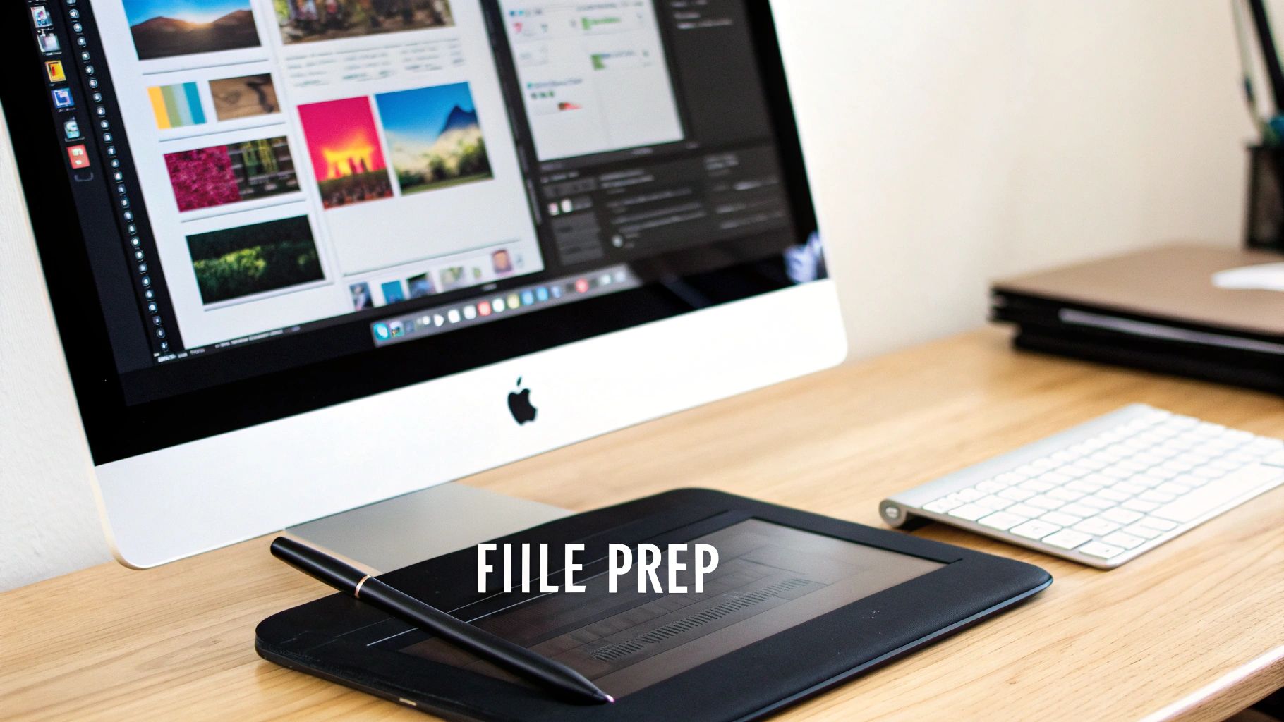
A stunning white ink print doesn't just happen at the printer. It all starts with a perfectly prepared digital file. Getting your artwork ready isn't rocket science, but it does demand a bit of attention to detail that's different from your average print job.
Think of your file as the blueprint for the final product. Just like a chef needs a precise recipe, a printer needs crystal-clear instructions to know exactly where to lay down that white underbase and where to apply the colours. Any small mistakes here can lead to frustrating production delays or a print that just doesn't look as sharp as you imagined.
Honestly, taking the time to set up your file correctly is the single best thing you can do to guarantee a flawless, professional result. In the UK's print industry—a massive £13.7 billion sector—efficiency and quality are everything. Many of the thousands of businesses are small teams that rely on getting files right the first time to keep things moving smoothly.
Creating a Dedicated White Ink Layer
This is the most critical step, hands down. You have to explicitly tell the printer where the white ink should go. You do this by creating a separate, dedicated layer or spot colour channel in your design software, whether you're using Adobe Illustrator, Photoshop, or something similar.
This layer is essentially a map just for the white ink. For a full-colour design on a dark garment, this layer will be a solid silhouette of your entire artwork. If your design only uses white ink, then this layer is your final artwork.
Imagine you're making a stencil. The cutout part of the stencil is your white ink layer—it shows exactly where the paint (or in this case, the ink) is supposed to go. Without this clear guide, the printer is flying blind and has no idea where to apply that essential underbase.
Vector vs Raster: Which Is Better?
The type of file you use has a huge impact on the final print quality. While both file types can work, one is usually a much better choice for getting those clean, sharp results we're all after.
- Vector Files (Preferred): Formats like AI, EPS, and SVG are the gold standard for this kind of work. Because they're built from mathematical paths, not pixels, you can scale them to any size without losing an ounce of sharpness. This guarantees your text and line art will have perfectly crisp edges every time.
- Raster Files (Use with Care): Formats like PNG and TIFF are made up of pixels. They’re fine for photorealistic images, but they must be high resolution—at least 300 DPI (dots per inch) at the final print size. If you send a low-resolution image, it's going to look pixelated and blurry when it’s printed on a shirt.
Getting your head around choosing the best image formats is a great starting point. While that article is about web images, the core principles of quality and file integrity are just as important for print.
Your Pre-Print Checklist
To avoid the common pitfalls and make sure everything goes smoothly, run through this quick checklist before sending your file off to a print provider like Psyque. It’ll save everyone time and hassle.
-
Create a White Ink Spot Colour: In your design software, make a new spot colour swatch. Name it something obvious like "White_Ink" or "Spot_White," and apply it to all the elements on your dedicated white layer.
-
Convert All Text to Outlines: This is non-negotiable. Converting fonts to outlines (or paths) turns your text into vector shapes. This means the printer doesn't need to have your specific font installed to open and print the file correctly.
-
Ensure a Transparent Background: Your final artwork needs to be saved on a transparent background. If you submit a design with a white or coloured background box still attached, guess what? The printer will print it.
-
Check Your Colour Mode: Make sure your file is set up in the correct colour space for printing. To get the full story on this crucial setting, check out our guide on the differences between CMYK vs RGB for print.
By following these guidelines, you're providing a perfect file that can move straight into production. The end result? Your white ink print will look exactly as amazing as you pictured it.
Choosing the Best Materials for Your White Ink Project
One of the best things about modern white ink printing, especially with Direct-to-Film (DTF), is just how incredibly versatile it is. While older printing methods might have you stuck with plain cotton t-shirts, DTF blows the doors wide open. Suddenly, you can put vibrant, tough designs on a massive range of materials.
Knowing which surfaces work best is the secret to moving beyond basic tees and exploring genuinely exciting product ideas. The flexibility and powerful adhesive in a DTF transfer make it a perfect match for both everyday and more unusual surfaces.
Going Way Beyond Traditional Fabrics
Forget being limited to 100% cotton. The real magic of DTF is its knack for sticking flawlessly to synthetic and blended fabrics where other methods just fail. This makes it the go-to choice for today's apparel and accessories.
Some of the most popular choices we see are:
- Polyester and Blends: This is your bread and butter for sportswear, activewear, and modern corporate gear. DTF bonds tightly to these synthetic fibres without making the fabric stiff or compromising its stretch.
- Denim and Canvas: These tough materials are brilliant for custom jackets, tote bags, and aprons. The white underbase is key here, making sure your colours pop against those thick, textured surfaces.
- Leather and Faux Leather: You can create some seriously high-end custom patches, accessories, and unique branding on things like notebooks or wallets. The finish looks professional and is made to last.
This adaptability has been a huge part of the growth in the UK's specialty printing scene. People want custom everything, and the industry is stepping up. In fact, the United Kingdom is home to 237 manufacturers and exporters of white inks, serving a buzzing local and international market. This healthy ecosystem is what allows businesses to get truly creative. You can find out more about the UK's white ink export market at volza.com.
Tackling Rigid and Unconventional Surfaces
While DTF is a superstar on textiles, it doesn't stop there. The technology works on a whole host of hard and semi-rigid items, making it a fantastic tool for promotional products and one-of-a-kind merchandise.
Just think about applying crisp, full-colour logos or designs onto things like:
- Wood: Perfect for creating custom signs, decorative plaques, or branded coasters.
- Acrylic: Great for keychains, awards, or point-of-sale displays.
- Hats and Bags: The transfers are flexible enough to mould to the curves of a cap or the uneven surfaces of a backpack.
Think of a DTF transfer like a high-performance decal. It's engineered to stick securely to a massive range of surfaces, not just fabric. It means the same tech you use for a polyester sports jersey can also brand a wooden box or a canvas bag, giving you amazing consistency across your entire product line.
Knowing the Limitations
For all its impressive versatility, no printing method can do it all. It’s just as important to know what doesn't work with a white ink print heat transfer process. Understanding the no-go materials will save you a world of time, money, and headaches.
As a rule of thumb, stay away from materials with special coatings or properties that stop the adhesive from getting a proper grip. This includes:
- Silicone-Coated or Waterproofed Fabrics: That high-performance rain jacket or outdoor gear often has a water-repellent finish that will simply shrug off the transfer's adhesive.
- Waxed Canvas: The waxy coating not only prevents a secure bond but can also melt under the heat press, which creates a real mess.
- Highly Textured or Uneven Surfaces: While DTF can handle a bit of texture, really rough surfaces like coarse burlap or some types of terry cloth can lead to patchy, poor adhesion.
When in doubt, the golden rule is always test first. Before you go all-in on a big production run, pressing a small sample onto your chosen material is the smartest thing you can do to guarantee a perfect result.
Making Your White Ink Prints Last
That crisp, bright white ink print looks amazing, and you’ll want to keep it that way. The good news is, with a little bit of care, you can. Modern DTF prints are seriously durable, but following a few simple aftercare steps will make sure your design stays vibrant for years—often even outlasting the garment itself.
The key to longevity is pretty simple: avoid high heat and harsh friction. These are the two biggest enemies of a print’s bond with the fabric. Protecting your custom gear from them doesn’t require any special kit, just a slight tweak to your usual laundry routine.
Essential Washing and Drying Tips
Think of your printed garment like any other quality piece of clothing. A gentler approach is always better, and it’s the best way to prevent cracking or fading, wash after wash. It all comes down to minimising stress on the print itself.
Here’s a straightforward routine to get into:
- Turn It Inside Out: Before it even hits the machine, always turn the garment inside out. This simple trick creates a protective barrier, stopping the print from rubbing against other clothes or the inside of the drum.
- Wash on a Cool Cycle: Hot water is bad news for the adhesive that bonds the ink to the fabric. Stick to a cool wash—ideally 30°C or lower—to keep everything locked in place and looking sharp.
- Use a Mild Detergent: Ditch the harsh detergents, bleach, and fabric softeners. Strong chemicals can break down the ink over time and cause the colours to fade. A gentle, colour-safe detergent is all you need.
"High heat is the primary enemy of any garment print. From the wash cycle to the ironing board, keeping temperatures low is the single most effective thing you can do to preserve the quality and lifespan of your custom apparel."
The Right Way to Dry and Iron
Your job isn't done when the washing machine beeps. How you dry and iron your printed items is just as important for making them last. Once again, the goal is to steer clear of excessive heat.
Air-drying is always your best bet. Just hang the garment up and let it dry naturally. If you’re in a rush and need to use a tumble dryer, be sure to use the lowest heat setting or a no-heat tumble cycle. The intense heat from a standard dryer cycle is one of the fastest ways to wreck a print.
Finally, if you need to get the creases out, never iron directly over the print. That kind of direct, focused heat can literally melt the ink and ruin your design in a second. Turn the garment inside out and iron the reverse side, or if you must, place a tea towel over the design before pressing. Understanding how temperature works is a game-changer, and our comprehensive heat press temperature guide offers deeper insights into how heat affects different fabrics.
Follow these simple rules, and your white ink print will stay a standout piece in your wardrobe for a long, long time.
Got Questions About White Ink? Let's Clear Them Up
Even after getting the hang of the basics, you probably still have a few practical questions knocking around. That's completely normal. Sorting out these details is what helps you budget properly, nail your design, and pick the right printing method for your project. Below, we’ve tackled some of the most common queries we hear day in and day out.
Think of this as a quick-fire FAQ to iron out any final wrinkles before you kick off your next custom apparel run.
Is Printing with White Ink More Expensive?
In short, yes, it usually is. The higher price tag comes down to a few things. First, the speciality white ink itself is a more complex and expensive formula than your standard CMYK colours. On top of that, the process requires that extra layer of ink—the underbase—which adds to both production time and the amount of material used.
The printers capable of handling the thicker white ink are also a serious bit of kit, representing a big investment for any print shop. But when you’re aiming for those punchy, professional designs on anything that isn’t white, it’s an essential cost for a top-quality, retail-ready finish.
Can I Just Print a Design in Only White Ink?
Absolutely! And you’d be in good company—it’s a massively popular way to create crisp, minimalist designs that really pop on dark or coloured garments. It’s an incredibly sharp and stylish choice for logos, text, or bold line art, especially on black, navy, or deep heather fabrics.
To get this done, you’d simply set up your artwork as a single colour. When you send it over, you’ll want to specify that the design should be printed using ‘spot white’ ink. This is the industry term that tells the printer to use white as the final, standalone colour, not as a base layer for other colours to sit on top of.
There's a reason a pure white ink print is a classic. It delivers a clean, sharp, and confident look that never seems to go out of style, making it a reliable go-to for brand merch and streetwear.
How Does a White Ink Print Actually Feel on a Shirt?
Modern white ink prints, especially those done with DTF technology, have a reputation for being incredibly soft, light, and flexible. The days of feeling like you're wearing a thick, plastic shield on your chest are long gone.
While some older, more traditional print methods can leave a heavy ‘hand’ (the technical term for the feel of a print), a quality DTF transfer blends almost seamlessly into the fabric's fibres. This gives you a really comfortable finish that moves and stretches with the garment, so it won’t crack or feel stiff over time and keeps the natural drape of the shirt.
Will the White Ink Go Yellow After a While?
Not if it’s done right with high-quality, professional-grade inks. Any reputable print provider will use inks formulated to be tough, durable, and resistant to fading from things like UV light and repeated washing.
When a white ink print is applied and cured correctly, the white will stay bright and bold for the lifespan of the garment. If you ever see yellowing, it's almost always a sign of cheap materials, an incorrect curing process, or poor aftercare—not a flaw in the technology itself.
Ready to bring your vibrant designs to life on any colour garment? Psyque specialises in premium DTF printing that delivers stunning, durable results every time. Explore our services and start your custom project today at https://psyque.co.uk.